HydraLytePlus liver support packaging
HydraLytePlus Liver Support is a 2in1 hydration drink mix in single serve stick packs. We designed its carton, stick packs, 3D renders, lifestyle scenes and a looping listing animation around one sunrise gradient.
HydraLytePlus
Supplements
2026
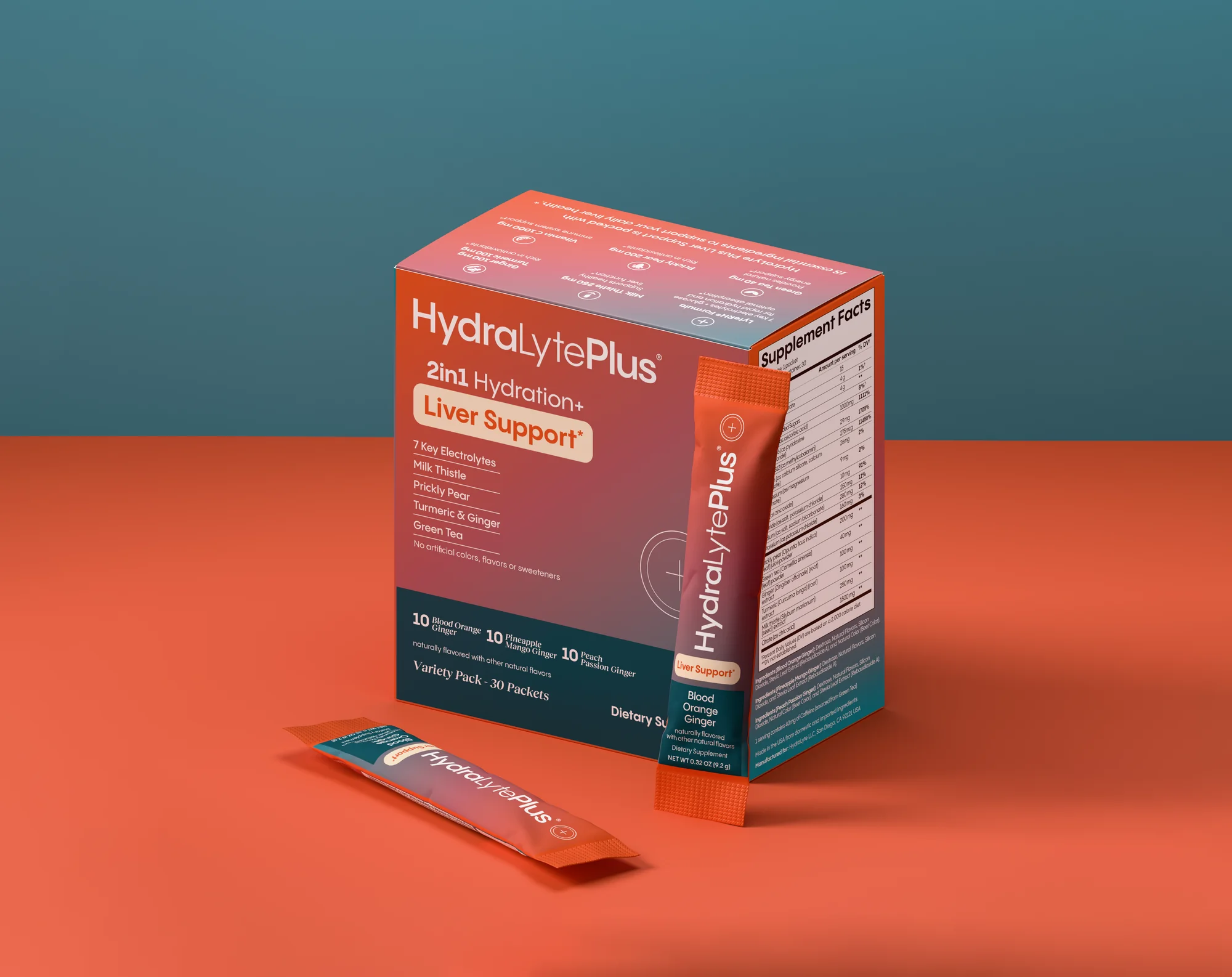
A hydration mix lives in two places at once: the box on a shelf or a product page, and the single stick pack that goes into a gym bag. The design treats both as one surface, with the same sunrise gradient running from the carton to every packet.
All product claims shown were supplied and approved by the client.
Brief
HydraLytePlus needed packaging for a 2in1 hydration and liver support drink mix, sold as a variety pack of 30 stick packs in three flavors: Blood Orange Ginger, Pineapple Mango Ginger and Peach Passion Ginger. We designed the carton and the stick packs, then built the 3D renders, the lifestyle scenes and a short listing animation to present them.
Challenge
The front had a lot to say: a brand name, a two part promise, five key ingredients and three flavors. It had to read at a glance on the carton and still fit on a narrow stick pack, while the back of the box carried directions, warnings and the facts panel.
The whole range in one loop.
A short listing animation gathers the carton, the stick packs, the lifestyle scenes and the benefit panels into one moving composition, then folds back to the box. It loops without a visible cut, so it works as a product page video or a social post.
A sunrise from coral to deep teal.
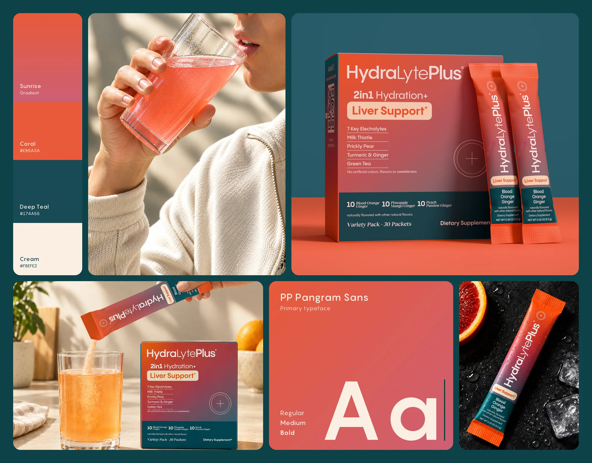
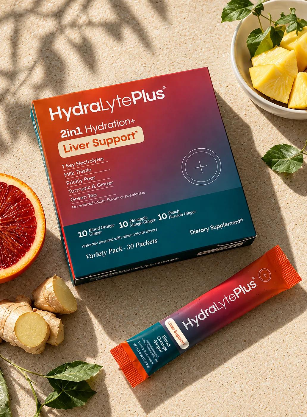
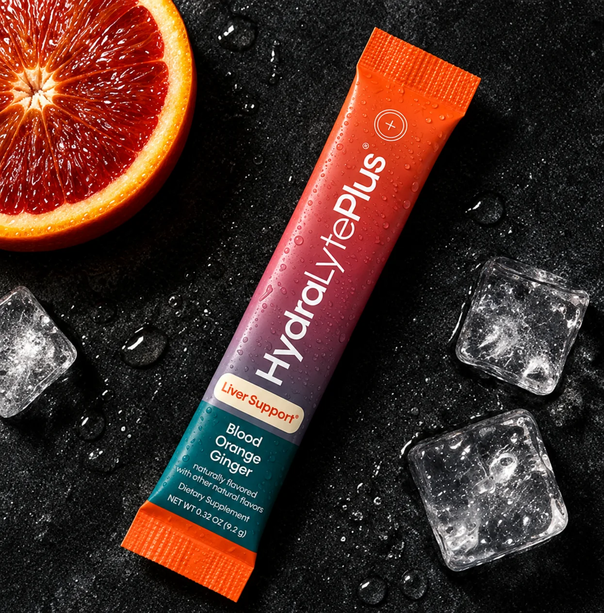
The palette starts warm and ends cool. A coral to rose gradient carries the brand name and the main promise, and a deep teal band holds the flavors and the pack count. Cream is kept for the Liver Support badge, so it is the first thing a shopper reads.
- Sunrise gradientCoral into rose, on every front
- Coral#E85A3A
- Deep teal#174A55
- Cream#FBEFE2
One typeface, three weights.
PP Pangram Sans in Regular, Medium and Bold sets everything from the brand name to the ingredient list, so a dense front panel still speaks with one voice. A serif italic is kept for small accents, like the flavor names and the variety pack line.
A whole brand on a narrow strip.
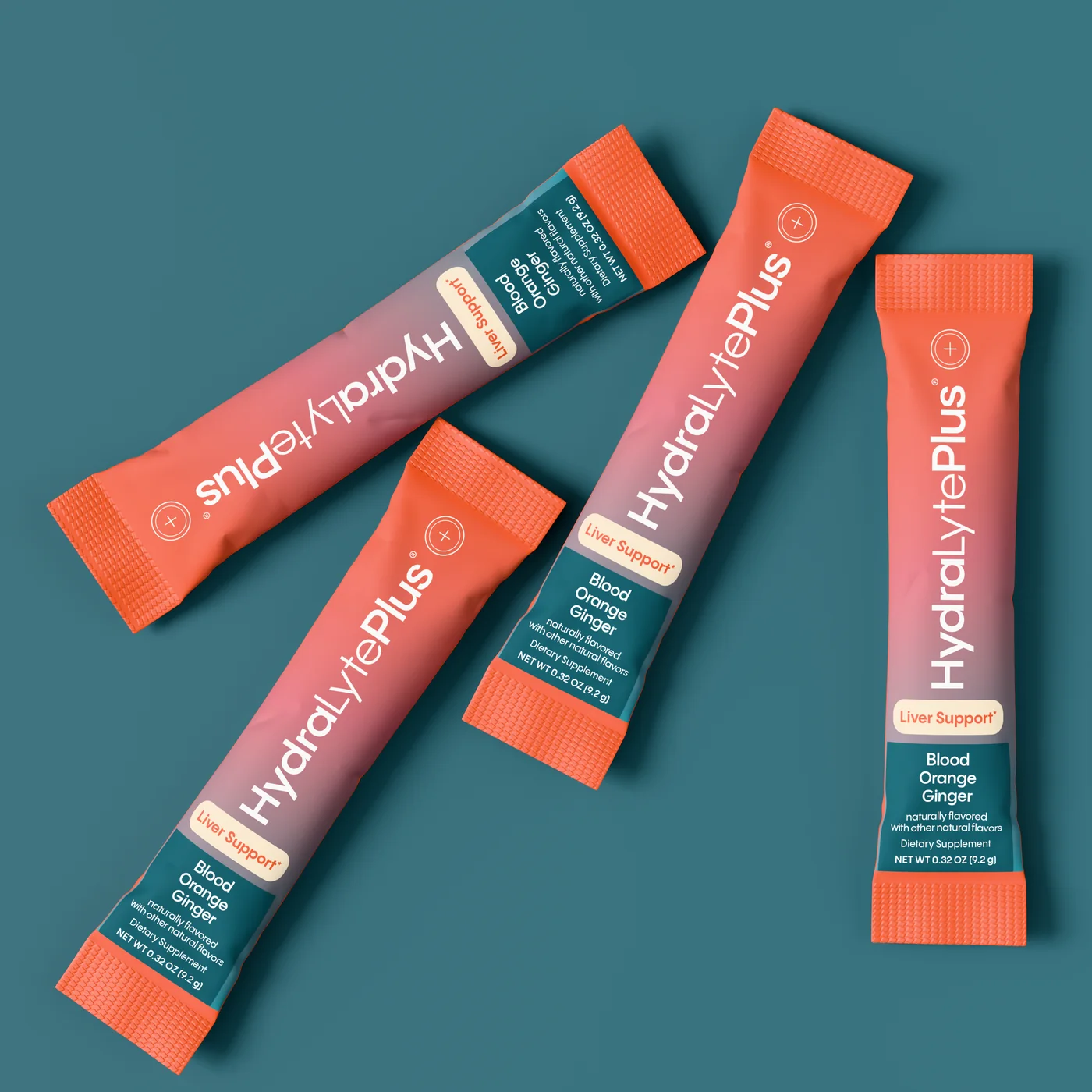
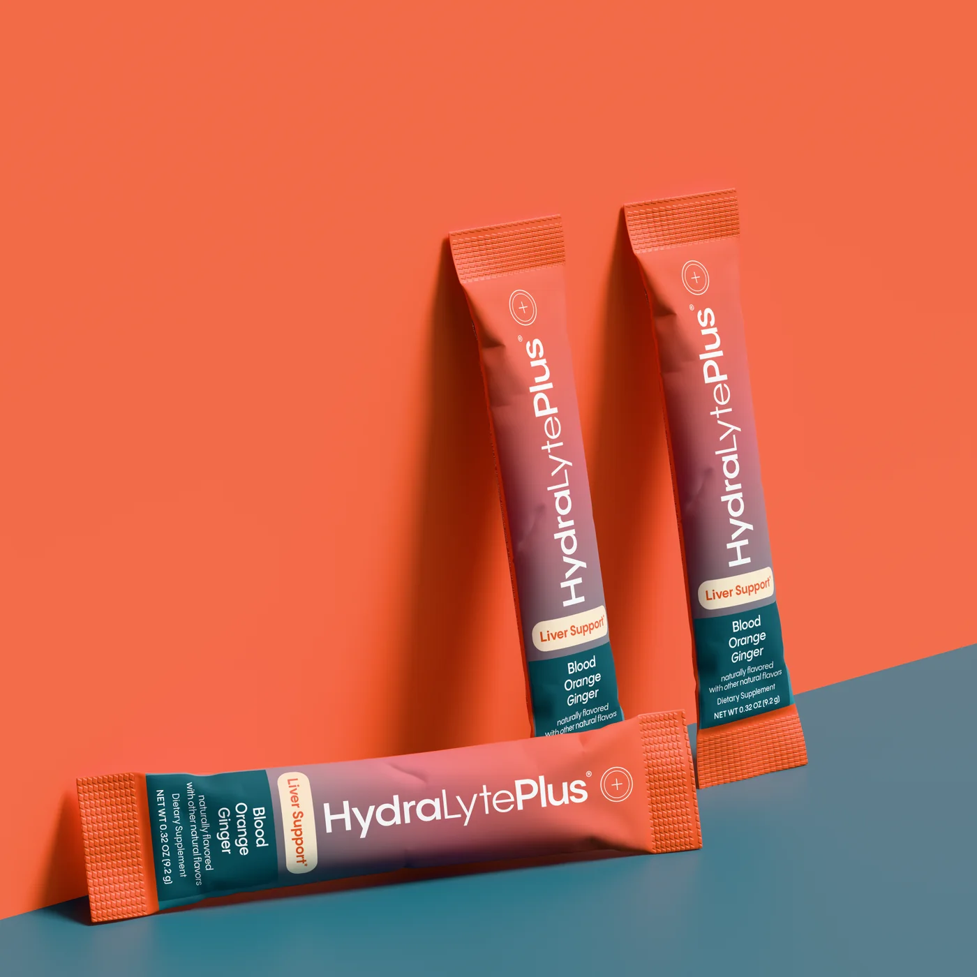
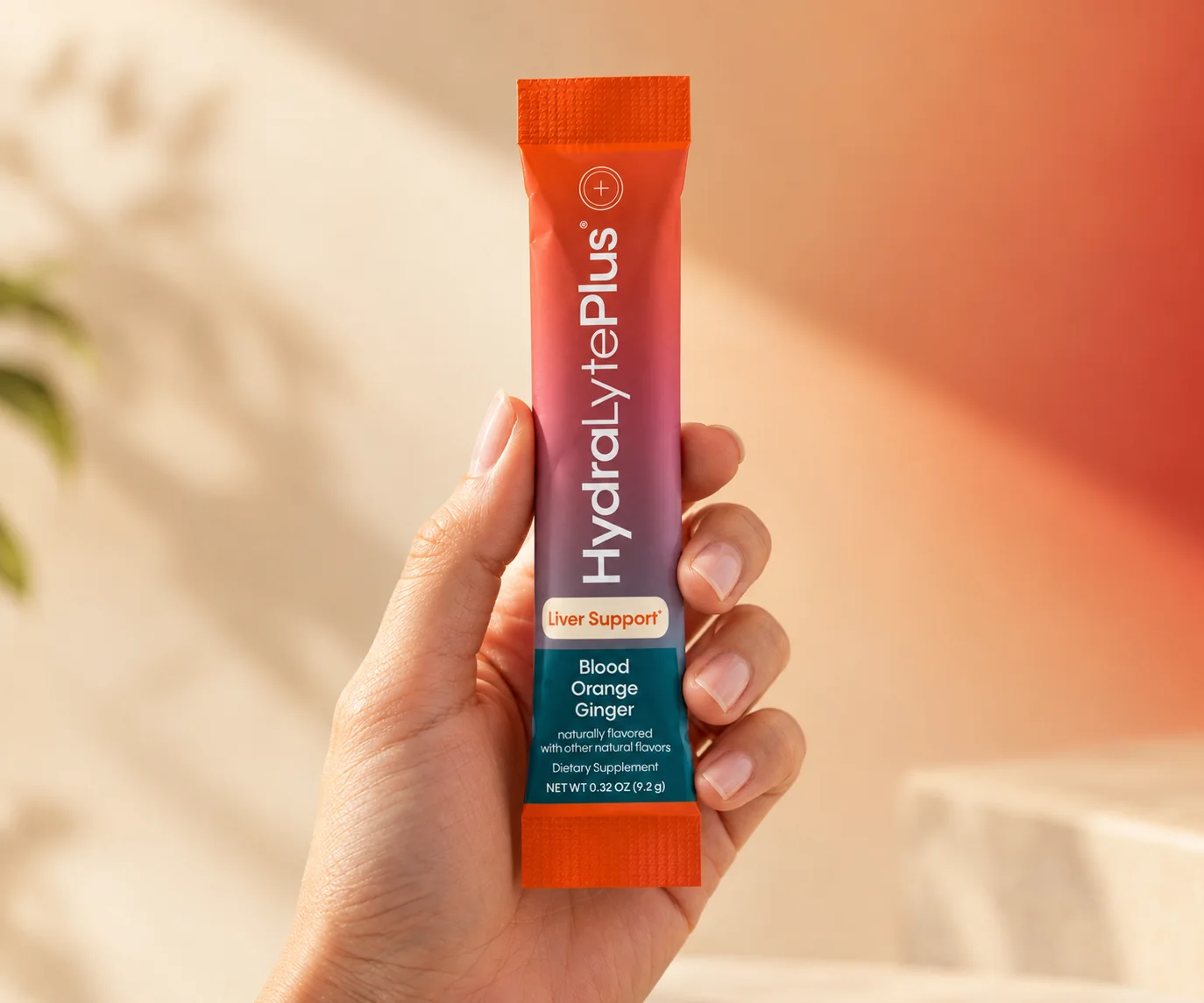
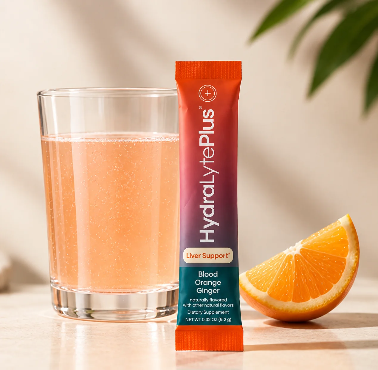
The brand name runs along the length of the stick pack, with the Liver Support badge and the flavor stacked in the teal band at the base. Held in one hand or dropped in a bag, it still reads as the same product as the box.
The front makes the promise, the back holds the facts.
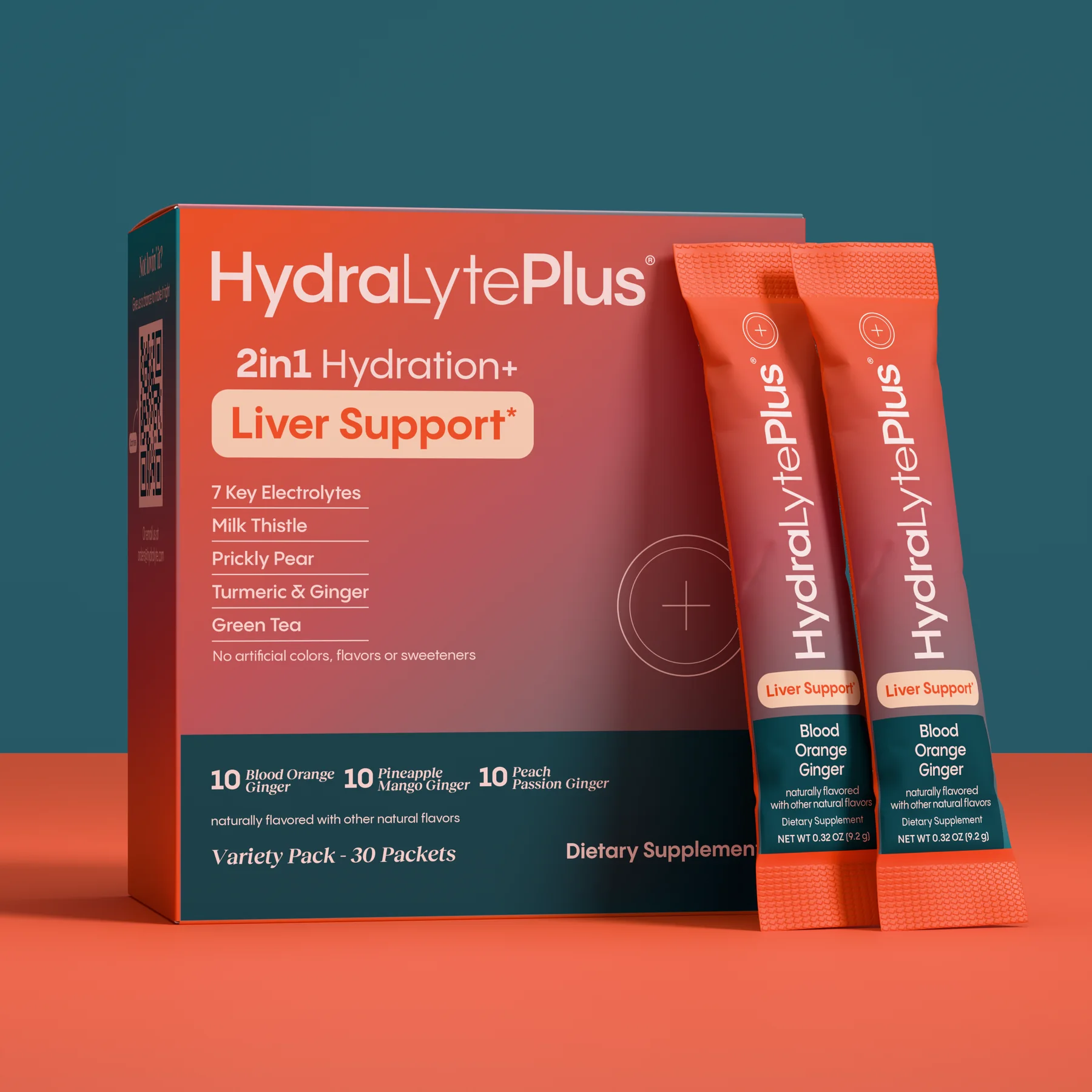
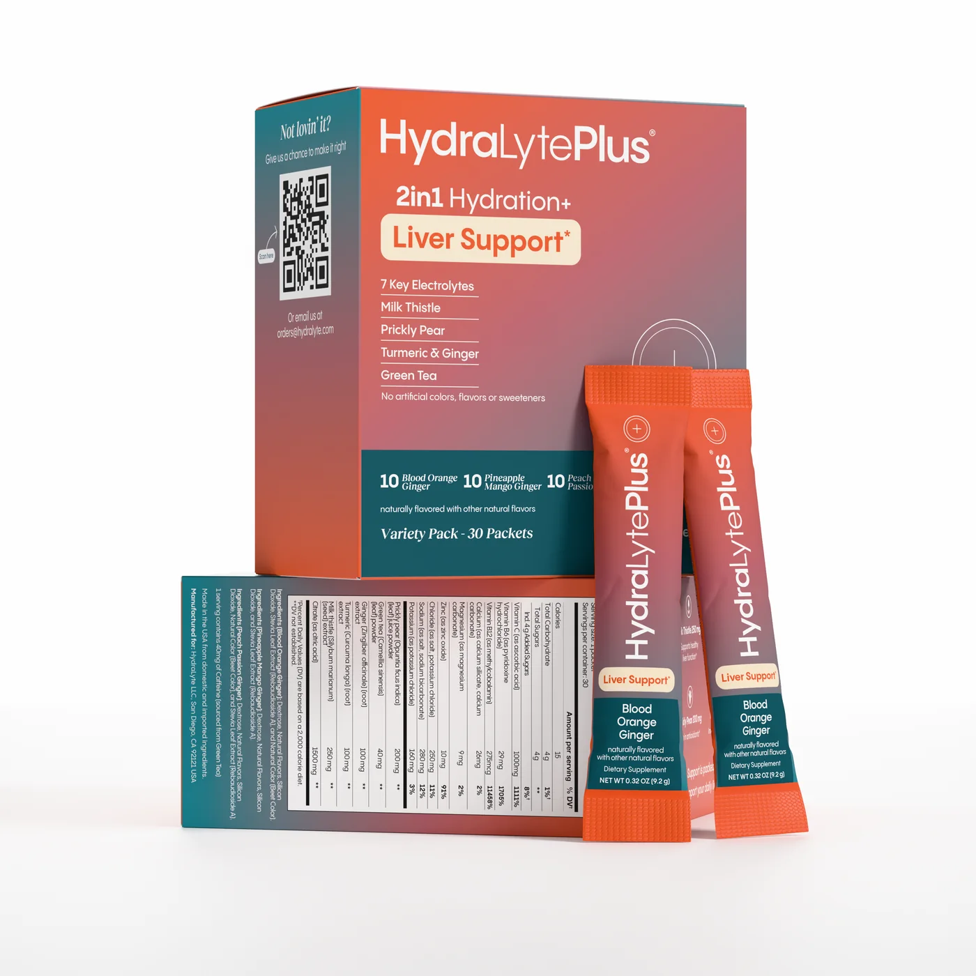
The front lists five key ingredients on simple ruled lines, with the flavor counts and the variety pack line in the teal band. Around the box, six ingredient icons with their amounts, a 500 Reasons to Love Your Liver panel, directions with Vegan, Gluten Free, Dairy Free and Non GMO badges, and a QR panel for customer care each get a panel of their own.
Every panel planned on the flat.
The carton artwork was laid out on the flat dieline, so each panel has a single job and the copy lands clear of folds and glue flaps.
- FrontBrand, Liver Support badge, five key ingredients, three flavors
- BenefitsSix ingredient icons with their amounts
- Story panel500 Reasons to Love Your Liver
- BackDirections, badges, warnings and the FDA statement
- Care panelQR code and a support email
From the kitchen counter to the pool.
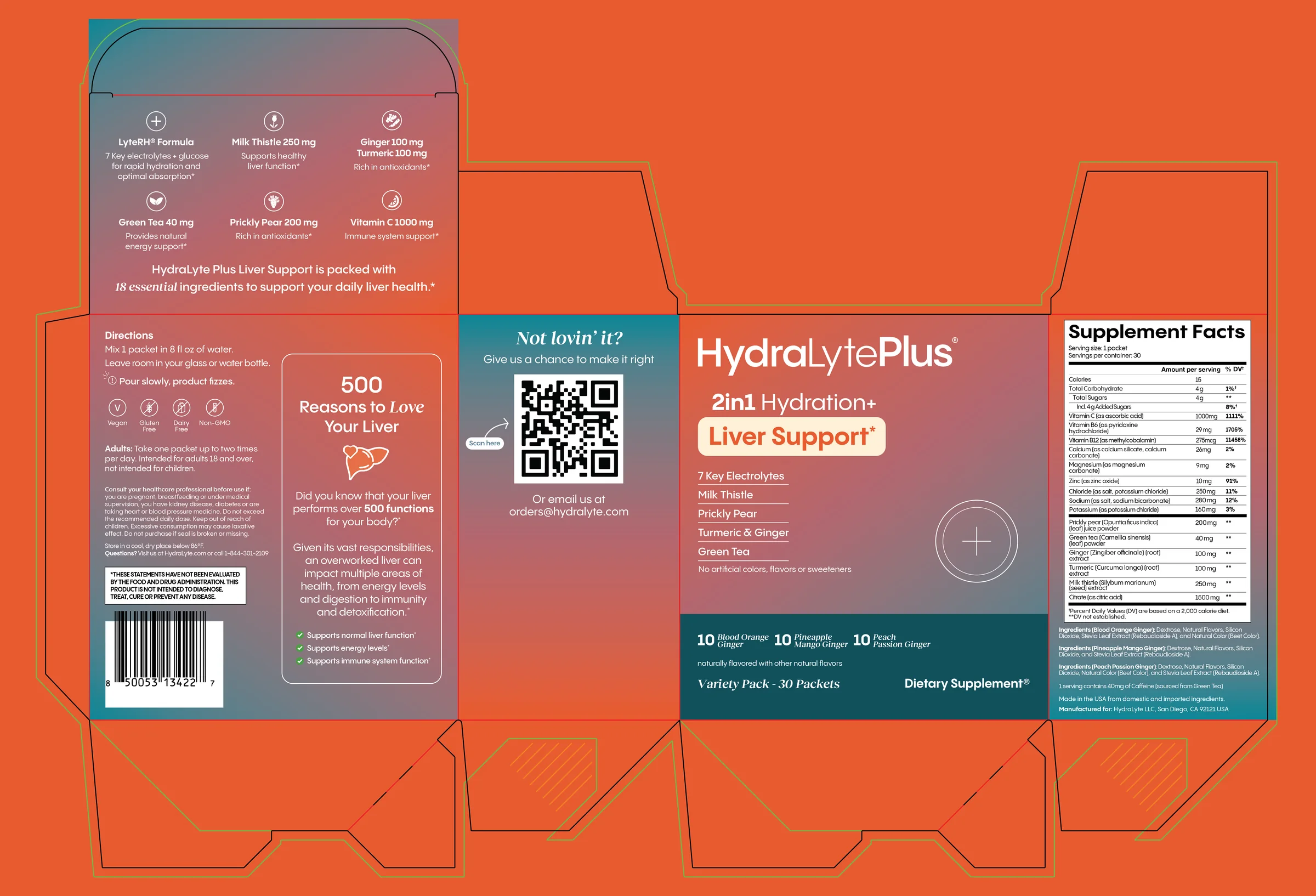
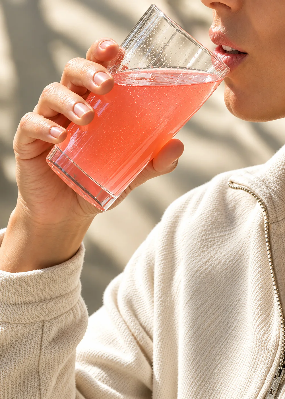
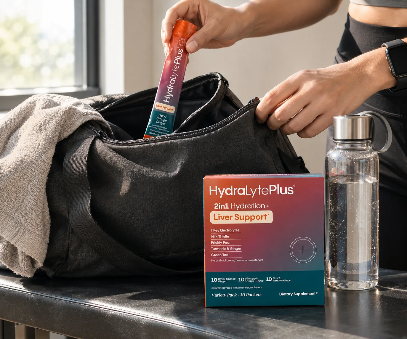
The lifestyle set puts the pack where it is used: mixed into water at home, packed into a gym bag, held in one hand. Warm daylight and real citrus keep every scene in the same palette as the carton.
Design Outcome
One gradient carries the brand from a 30 packet carton to a single stick pack, a looping animation and every lifestyle scene. A shopper can match the packet in a gym bag to the box on a shelf at a glance, and the dense back of the box stays easy to read.
- Carton artwork on the dieline
- Stick pack artwork
- Color and type system
- 3D product renders
- Lifestyle scenes
- Looping listing animation
Next project
Elvara
Brand identity and packaging for Elvara, a three step skincare routine: a lowercase wordmark, a two color palette and quiet labels on frosted glass.
View case study