Elvara skincare packaging
Elvara is a three step skincare routine. We designed its identity and packaging with a lowercase wordmark, two colors, and quiet labels on frosted glass.
Elvara
Skincare
2025
The brand describes itself as skincare with intention: visible results, clean ingredients and a quiet kind of confidence. The identity takes that idea literally. Each element is reduced until only what matters is left.
Brief
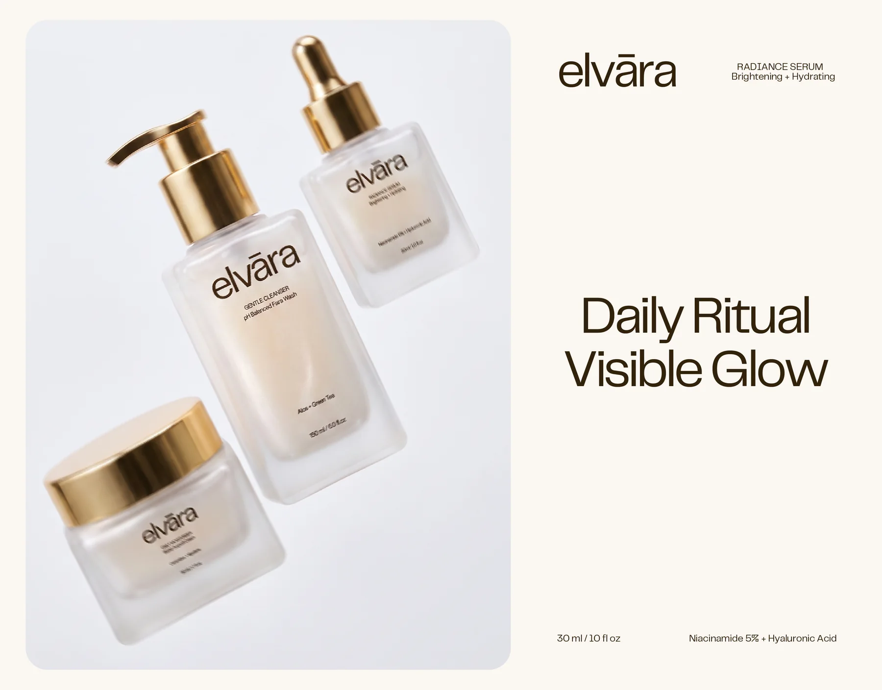
Elvara came to us with a short routine, three products that had to feel like one idea. A cleanser, a serum and a moisturizer, each in frosted glass with gold closures. We were asked to build the brand and the packaging from the wordmark to the labels and the layouts that show the range.
Challenge
Three glass formats do not naturally sit together. A pump, a dropper and a deep lid jar each read differently in the hand, and each label still had to make its product name, actives and volume easy to find. The idea had to stay quiet, with no extra decoration to hide behind.
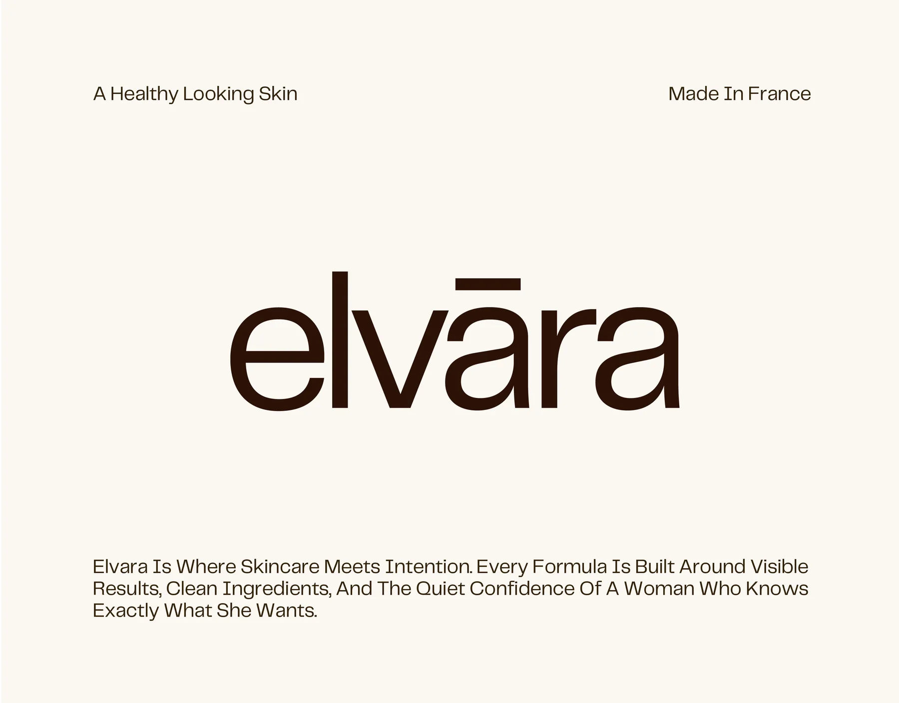
A wordmark with one accent.
The elvāra wordmark is set in lowercase in a soft, open sans serif. Its one distinctive detail is the macron over the a: a single line that makes the name memorable without needing a symbol.
The palette is just as restrained. A deep brown carries the type and the darker brand panels, and a warm off white gives the layouts room to breathe.
- Deep brown#33220B · wordmark, type and dark panels
- Warm off white#FAF7F2 · backgrounds and space
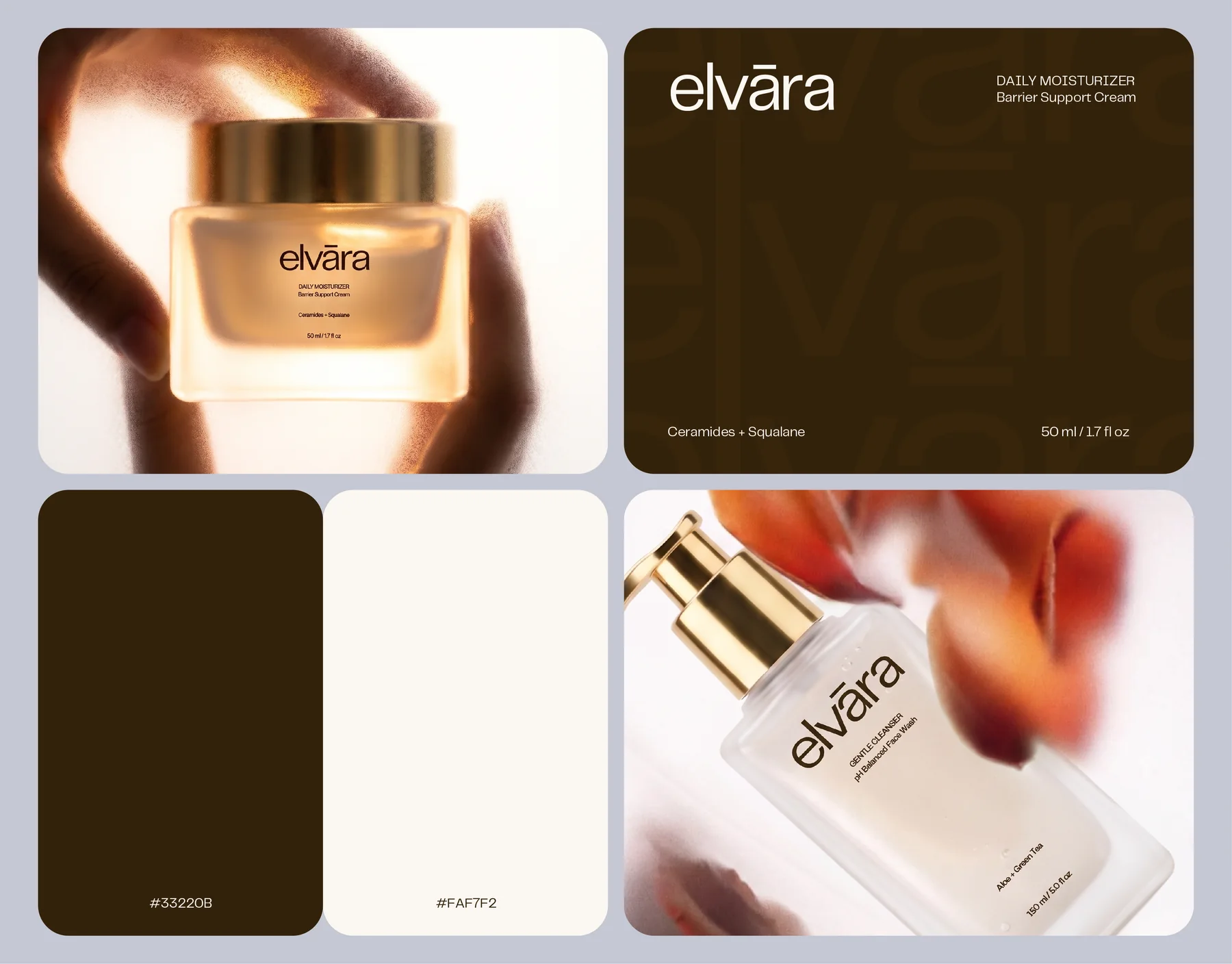
Frosted glass, gold and a quiet label.
The three products share one material language: frosted glass with gold closures, a pump for the cleanser, a dropper for the serum and a deep lid for the moisturizer. The label is printed in the brand brown and follows the same order on every pack: wordmark, product name in capitals, a short descriptor, the key actives and the volume.
- Gentle CleanserpH balanced face wash · Aloe + Green Tea · 150 ml
- Radiance SerumBrightening + hydrating · Niacinamide 5% + Hyaluronic Acid · 30 ml
- Daily MoisturizerBarrier support cream · Ceramides + Squalane · 50 ml
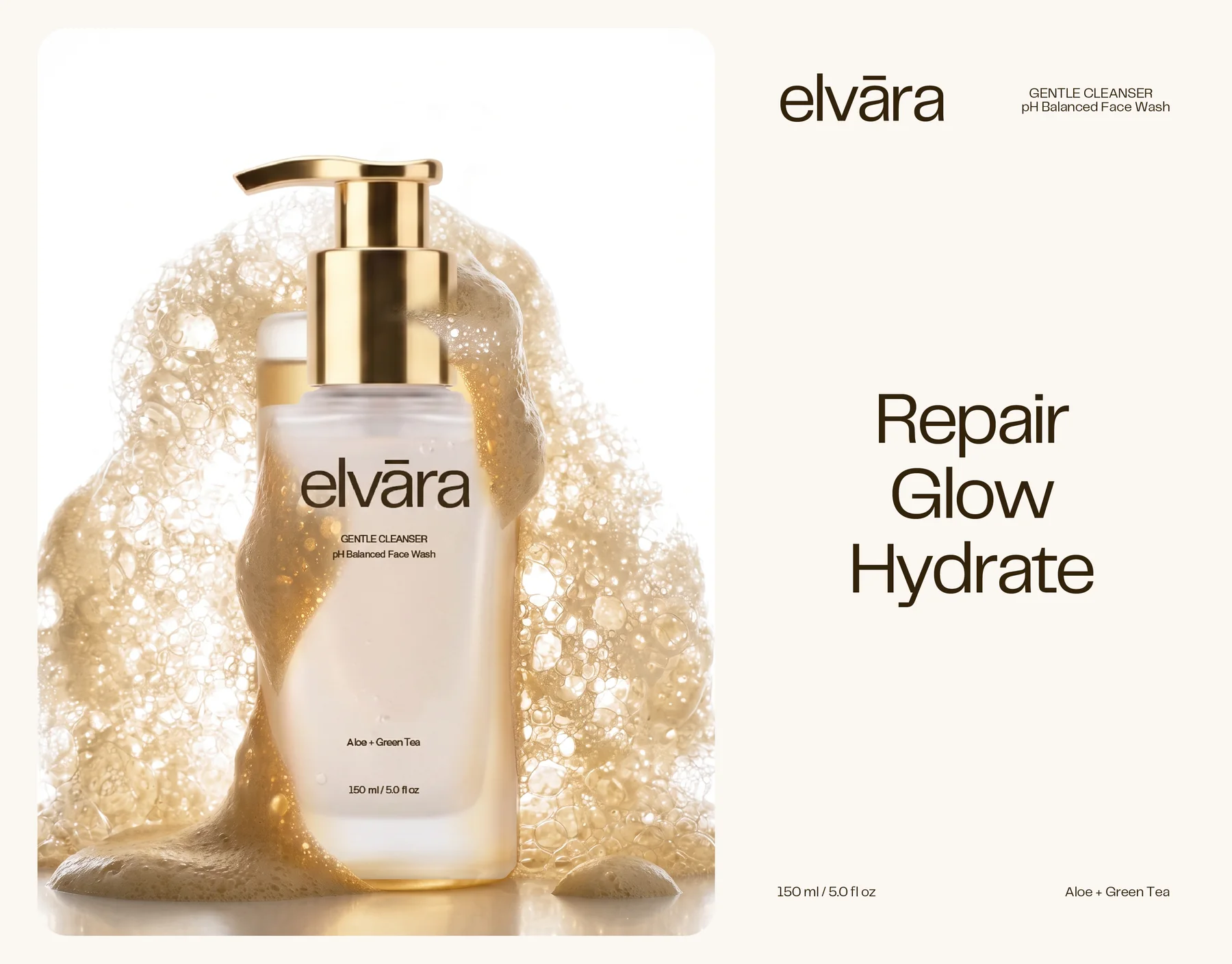
An editorial system around the packs.
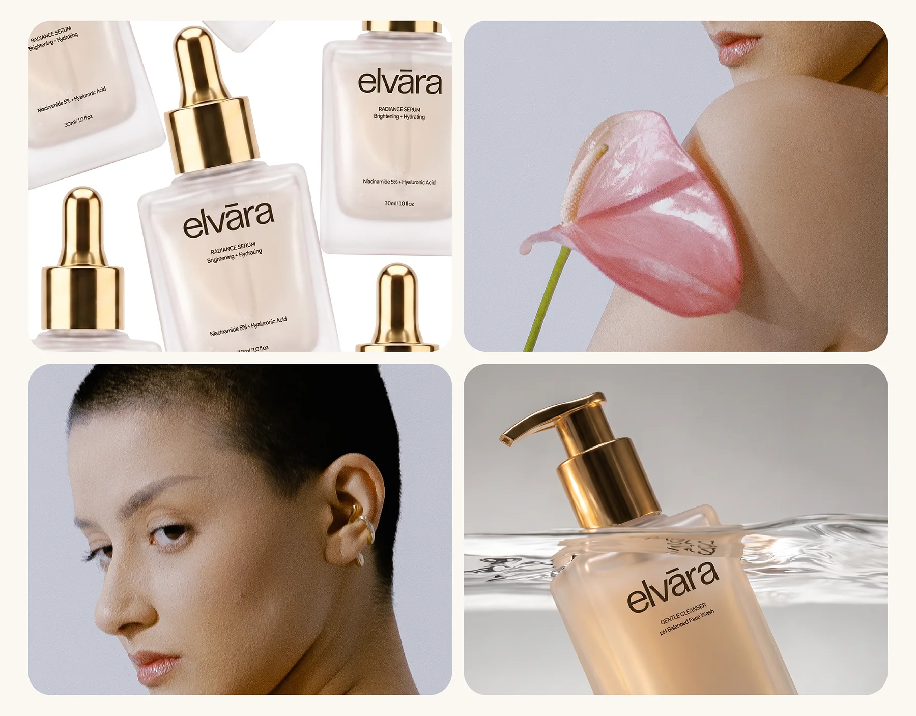
The identity extends into a set of layouts with softly rounded frames, short headlines such as Repair, Glow, Hydrate and Daily Ritual, Visible Glow, and the wordmark enlarged into a tone on tone pattern on brown panels. Product images sit beside portrait photography and flowers, which keeps the brand warm rather than clinical.
Design Outcome
In the end the three packs sit calmly together on shelf and on screen. The lowercase wordmark, the deep brown and warm off white palette, and the same label order make the routine feel considered, not assembled.
- Lowercase wordmark with a single macron
- Brown and off white palette with typography
- Labels for the cleanser, serum and moisturizer
- Packaging across pump, dropper and jar formats
Next project
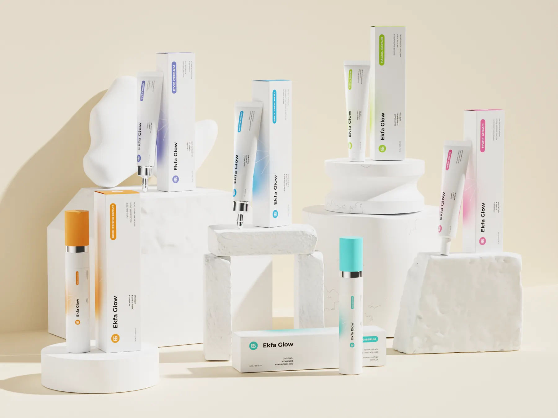
Ekfa Glow
A packaging system for a six product skincare range: one clean white language across serums, tubes and cartons, with a color for every formula.
View case study