Ekfa Glow packaging system
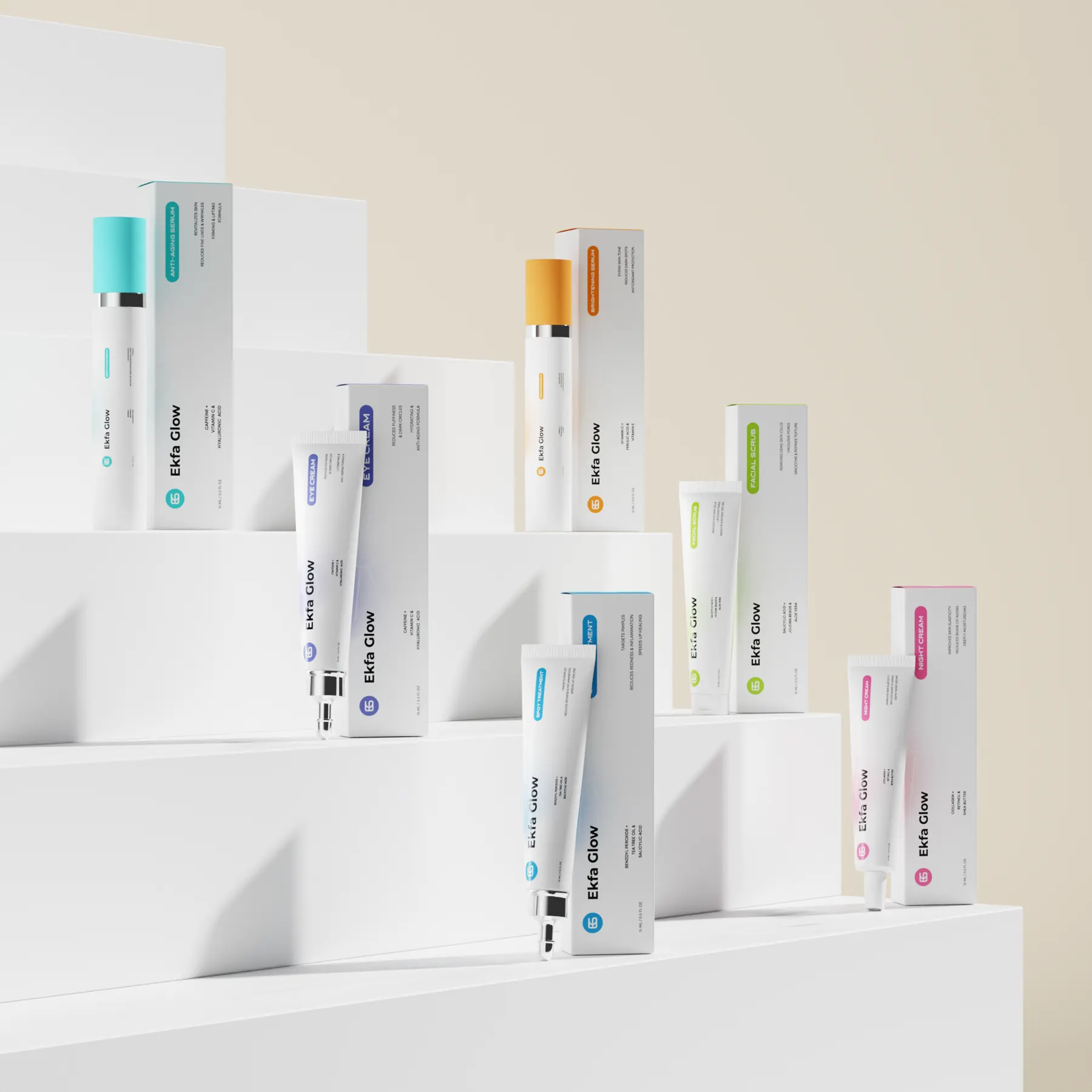
Ekfa Glow is a six product skincare range. We designed one white packaging system where color tells each formula apart across serums, tubes and cartons.
Ekfa Glow
Skincare
2025
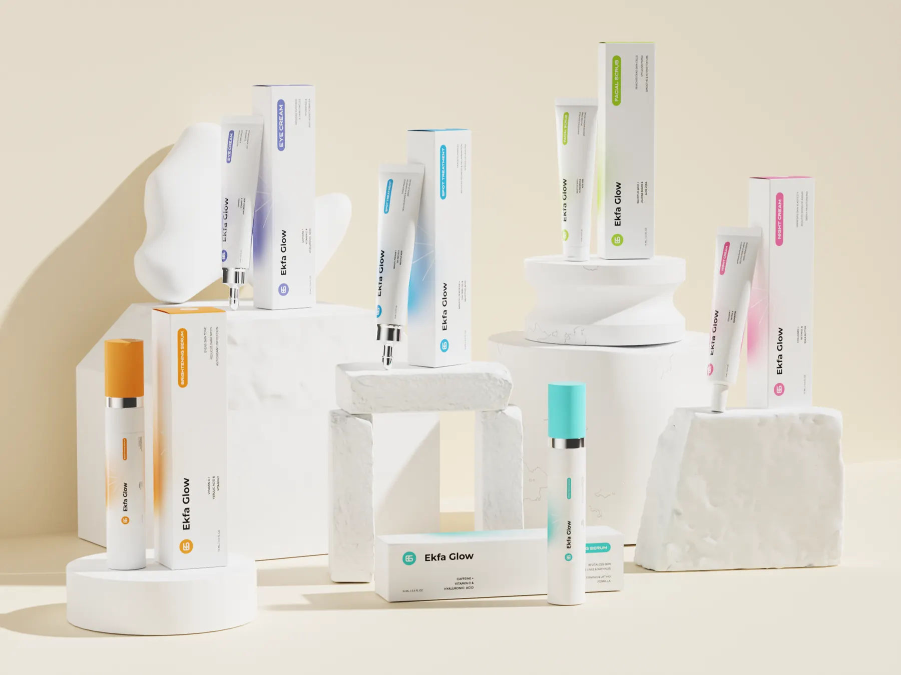
A range like this asks for balance. The answer is a calm white system that stays constant from pack to pack, and lets color tell the formulas apart.
Brief
Ekfa Glow had six formulas that needed to live as one line. Two serums, an eye cream, a spot treatment, a scrub and a night cream, across bottles, tubes and cartons. We were asked to design the full system and the 3D visuals to present it.
Challenge
Six products with very different jobs can easily look like six separate brands. Each one also had to be easy to pick out at a glance, even on a narrow 15 ml panel with little room to spare. The system had to be strict enough to hold, but flexible enough for every format.
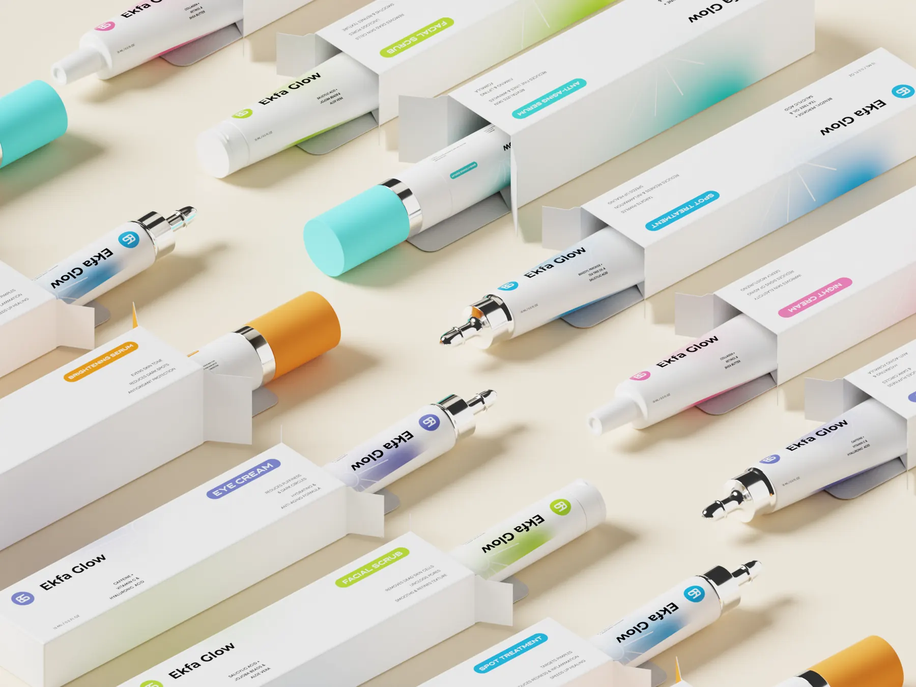
One system, six formulas.
Every pack starts from the same white base, the Ekfa Glow wordmark and the EG monogram. Each formula then takes one color and uses it in three places: the tab that carries the product name, the monogram, and a soft glow of color behind the wordmark. A fine starburst line runs through the glow, a quiet reference to the name.
Because the color always appears in the same places, the range reads as a set, and each product can be identified from across a room.
- Brightening SerumVitamin C, ferulic acid and vitamin E
- Anti Aging SerumFirming and lifting formula
- Eye CreamFor puffiness and dark circles
- Spot TreatmentBenzoyl peroxide, tea tree oil and salicylic acid
- Facial ScrubSalicylic acid, jojoba beads and aloe vera
- Night CreamCollagen, retinol and shea butter
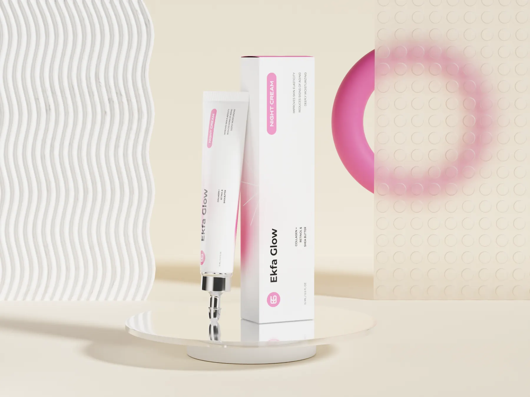
Brand, product, ingredients, benefits.
The wordmark is set large and runs vertically along each tube and carton, so the brand stays visible on slim formats without crowding the front of the pack.
The product name sits in a rounded, color filled tab, set in capitals so it reads immediately after the brand. The key ingredients follow as one short line, and three benefits close the panel in small capitals. Every pack keeps the same reading order, so a customer who learns one learns them all.
Designed for small, narrow panels.
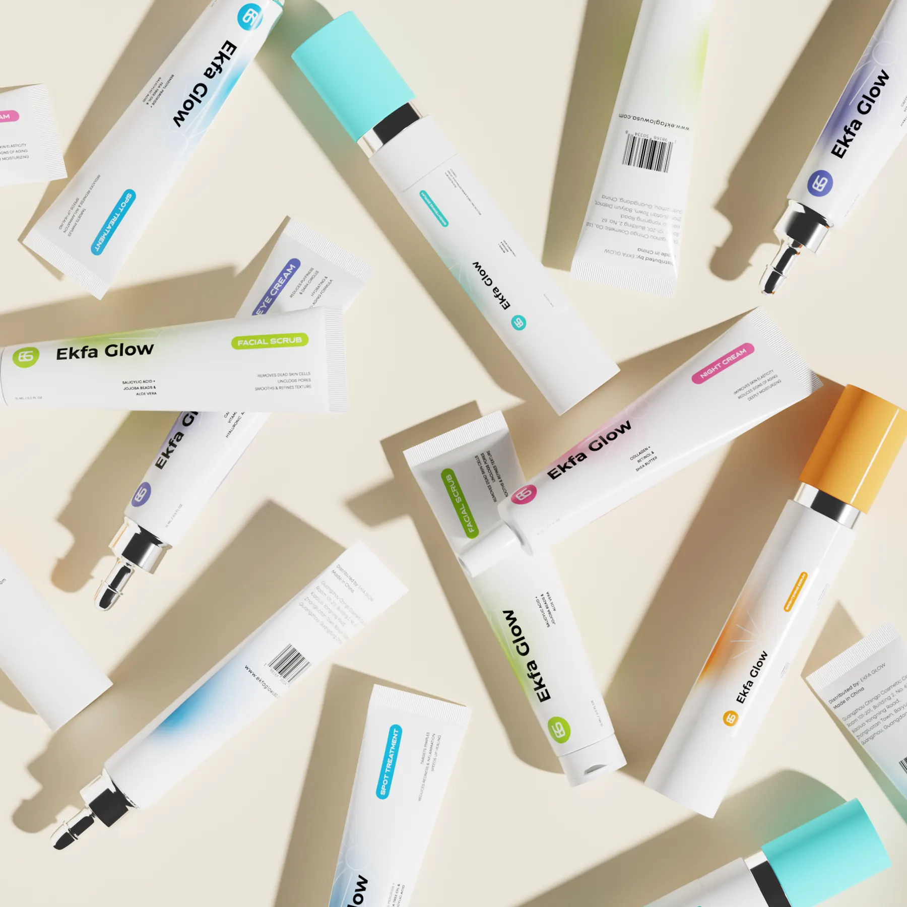
The system runs across several formats: serum bottles with colored caps and metal collars, slim tubes with metal applicator tips, a squeeze tube for the scrub, and a tuck end carton for each product. At 15 ml the panels are narrow, so the layouts hold generous white space and keep each face to what a customer needs at that moment.
Back panels carry the barcode, distribution details and the brand’s web address in the same type system as the front, so the information side of the pack feels as considered as the face.
The range, rendered.
We presented the line in a series of photoreal 3D scenes: a styled group shot, structured flat lays and close studies of single products. Warm, sculptural sets keep the attention on the white packs and their colors.
Design Outcome
One white base with color in the same three places on every pack does the work. A buyer can learn one pack and then find any other formula by its color, while the whole line still reads as one set.
- Layout rules shared by every pack
- Front and back artwork for six products
- 3D scenes: a group shot, flat lays and single products
Next project
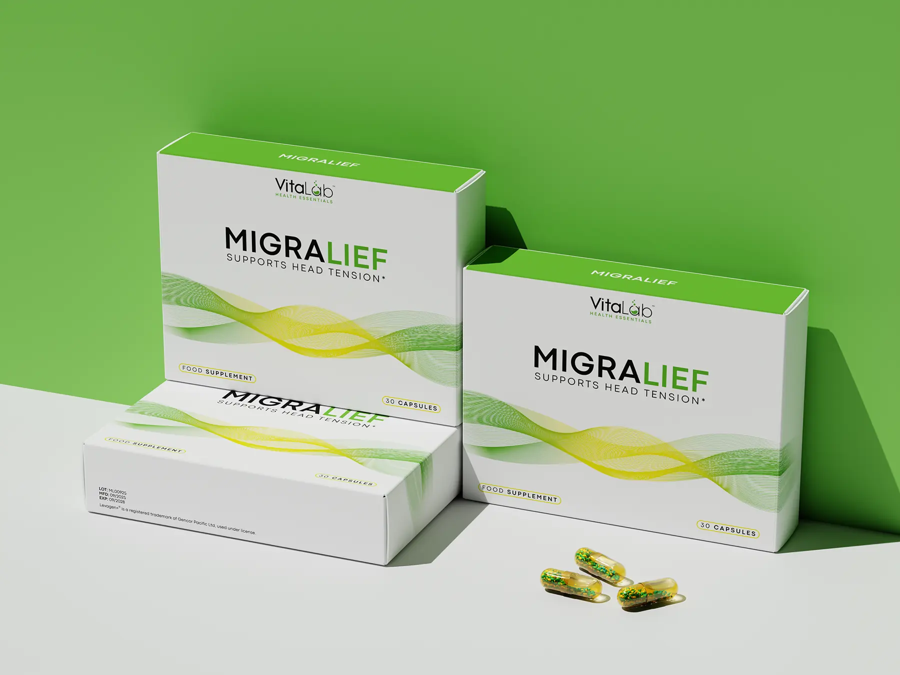
Migralief
A carton and blister system for Migralief, a head tension supplement: one flowing wave graphic that carries across the carton, the blister and every render.
View case study