A finish changes more than the surface. It changes how deep a color looks, how a box feels in the hand, how it holds up in a warehouse and how it photographs for a product page. Picking one is a tradeoff between look, feel, durability and cost.
Before choosing, answer three questions. Where will the pack mostly be seen: on a shelf, in an unboxing, or in a product photo? How much handling will it take? And what should it feel like when someone picks it up?
Gloss: bright color, easy to wipe clean
Gloss lamination or varnish makes colors look more saturated and gives a smooth, reflective surface. It is durable and wipes clean easily, which suits everyday products that get handled a lot.
The tradeoff is reflection. Under shop lights and studio lights, gloss throws glare across the type and the logo, and smudges show, even if they wipe off. In skincare, full gloss can also read as less premium than a matte surface.
Matte: calm, modern and easy to read
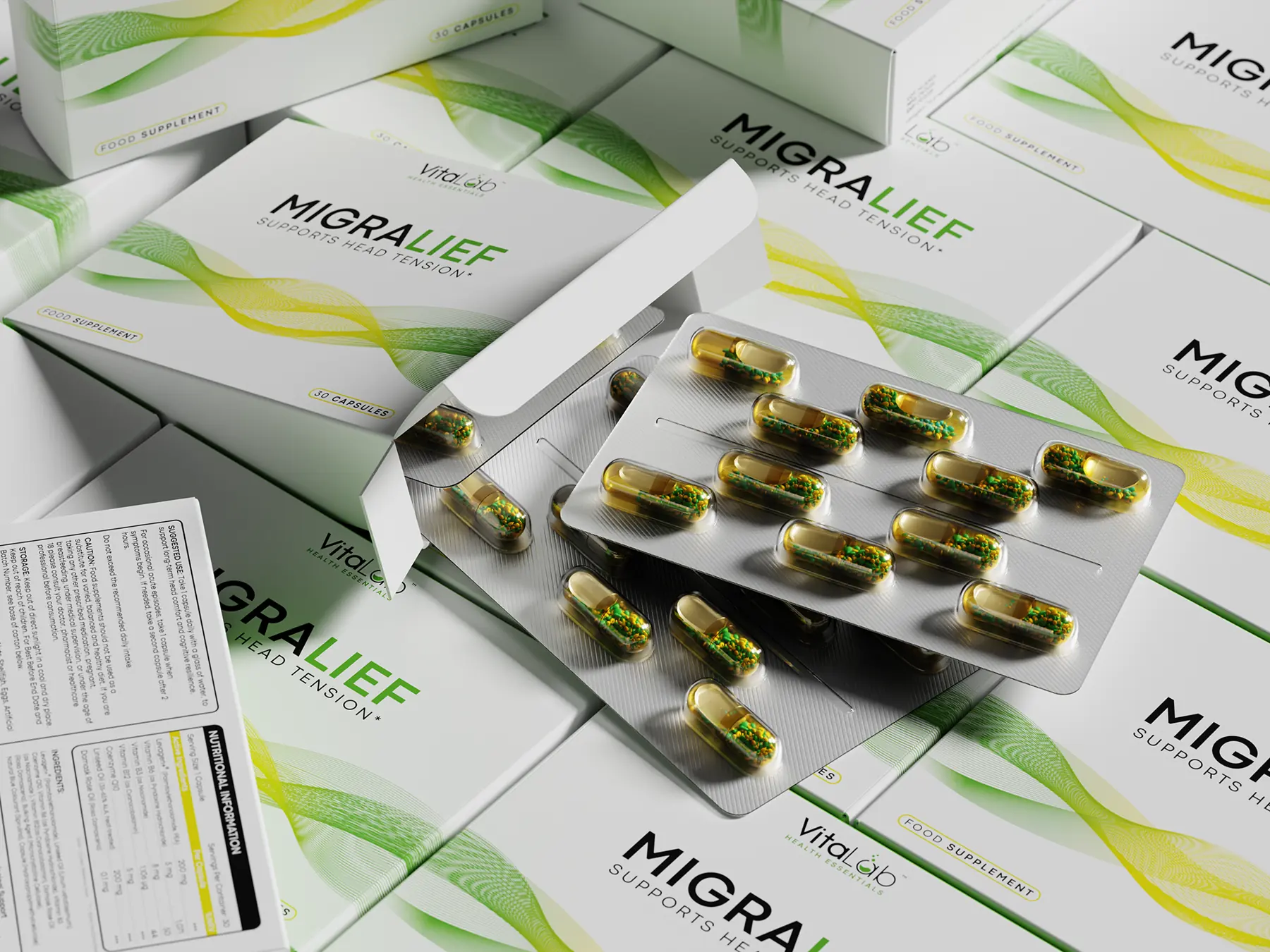
Matte lamination takes the shine away, so text stays readable from any angle and the pack photographs without glare. Colors look slightly deeper and more muted, which flatters dark, rich palettes.
Matte is the default for a lot of skincare and premium supplement packaging. Its weakness is scuffing: on dark matte boxes, scratches and fingerprints can show, so plan for careful packing.
Soft touch: the finish people remember
Soft touch lamination adds a velvety, slightly rubbery feel. It is the finish customers comment on when they pick a box up, which is why it is popular for premium skincare, fragrance and gift boxes.
It costs more than standard matte, mutes colors a little further and can mark with heavy handling. It works best on boxes that are opened once and kept, rather than ones handled every day.
Spot UV: gloss exactly where you want it
Spot UV is a clear, glossy coating applied only to selected areas, usually on top of a matte base. The contrast lets a logo or a pattern catch the light while the rest of the pack stays quiet.
For the Medusa Interface mailer box, we specified a matte lamination with spot UV on the Medusa mark, so the logo lifts against the matte black field.

Foil: a metallic shine that ink can’t match
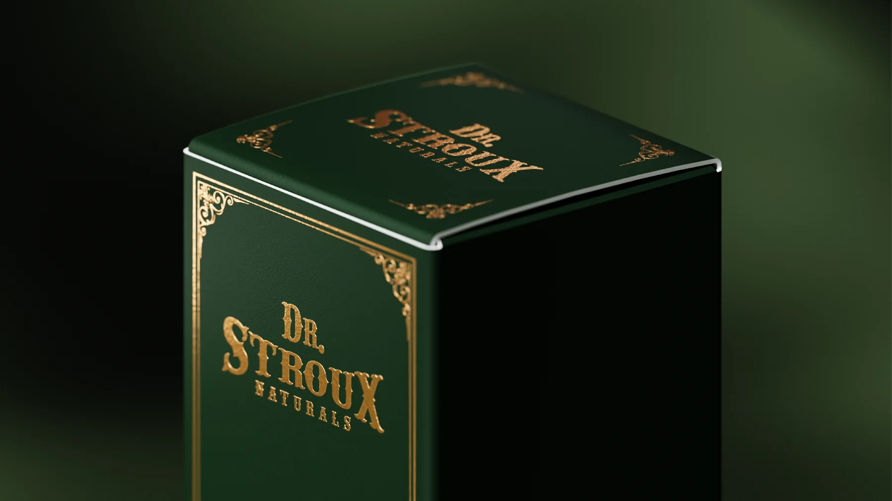
Foil stamping presses a thin metallic film onto the board. Gold, silver and copper are the classics, and holographic foils are an option too. Even good metallic inks can’t match its mirror like shine.
Foil works best in small, deliberate amounts: a logo, a border or a few key words. Large solid areas are harder to apply cleanly and can look heavy. Dr. Stroux Naturals pairs gold foil with a deep green carton for an apothecary feel that suits a herbal tincture.
Embossing and debossing: a finish you can feel
Embossing raises part of the design and debossing presses it in. Without any ink (a blind emboss), it adds texture that mostly shows as light moves across the surface, which is about as quiet as premium gets.
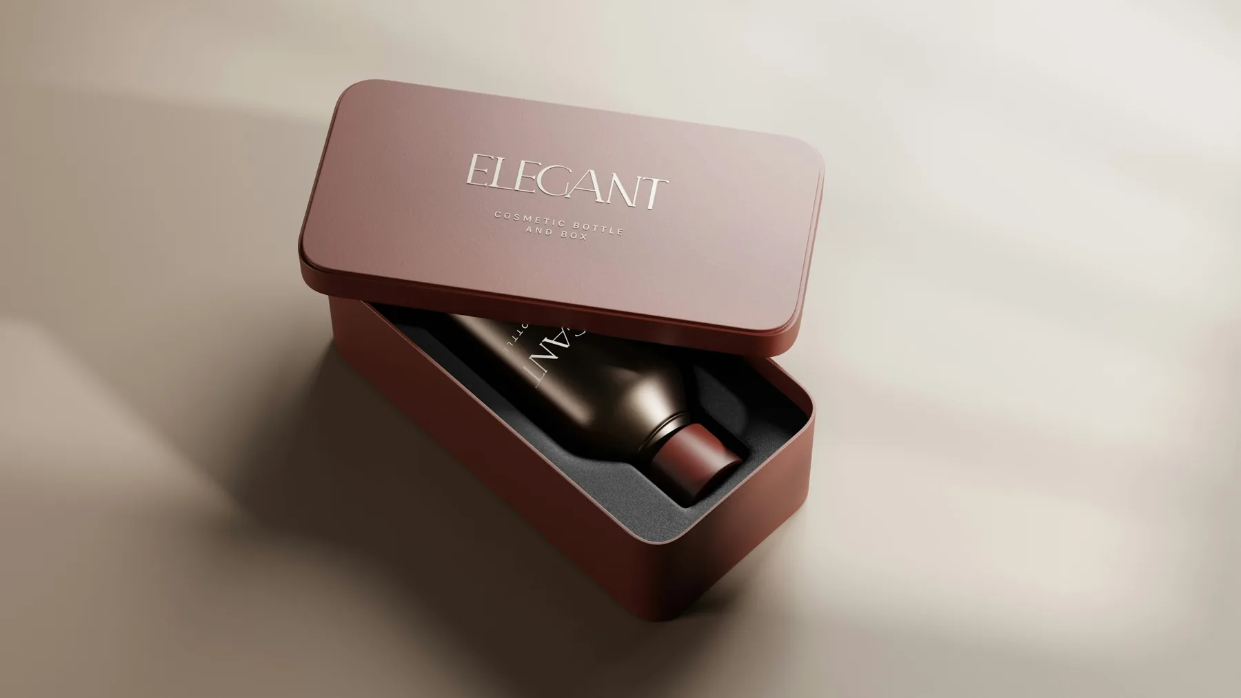
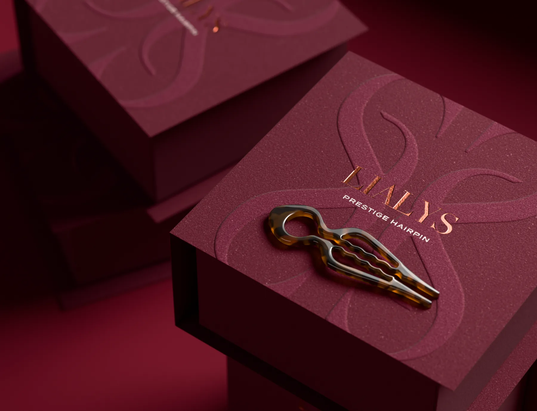
On the LiaLys rigid box, a large monogram is embossed tone on tone into a soft, textured burgundy wrap, and the wordmark sits over it in metallic copper.
Combining finishes
The strongest packs usually pair one base finish with one accent: matte with spot UV, soft touch with foil, or a textured paper with a blind emboss. Once three or four effects compete on one box, none of them stands out.
On the LiaLys rigid box, a blind emboss is paired with a copper wordmark: one quiet texture and one metal.
Before you choose
- Ask your printer which finishes they offer on your board, and how each is priced. Foil and embossing need custom dies, which adds a setup cost.
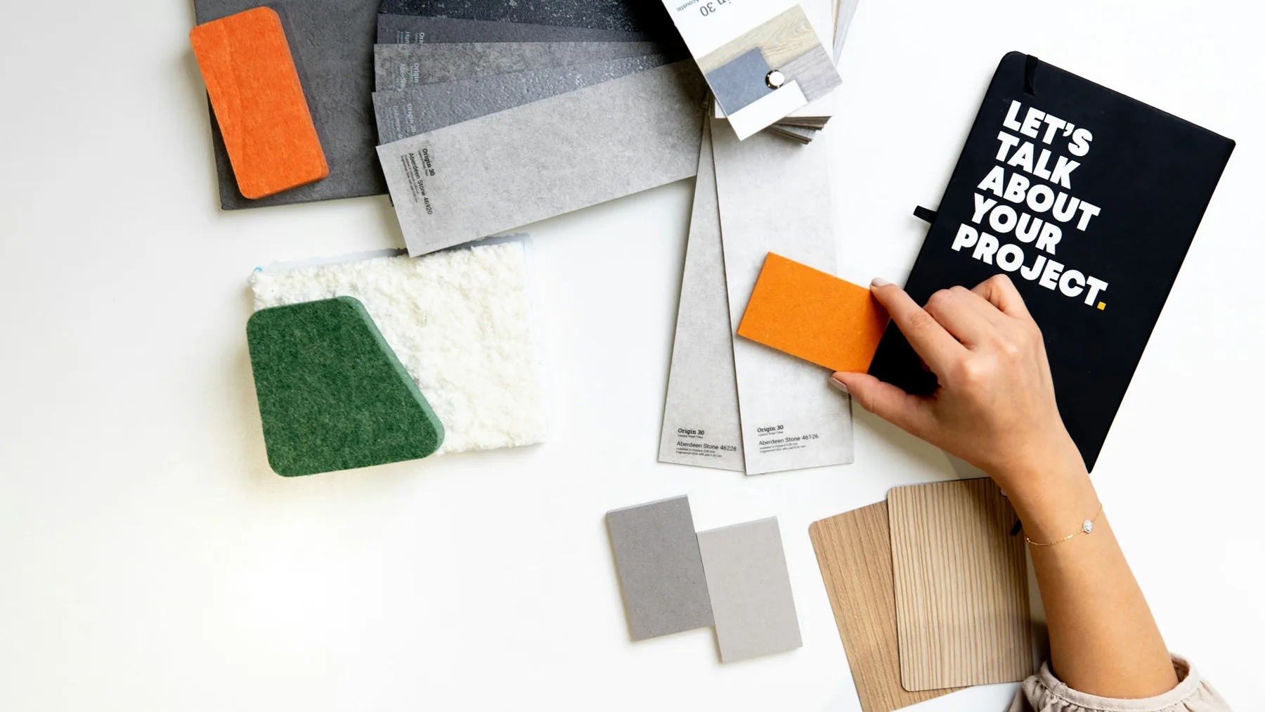
- Get a physical sample or a finished proof. A screen can’t show texture or how foil catches the light.
- Check small text against the finish. Fine type under foil or a deep emboss can fill in or lose detail.
- Think about the product photo too. Gloss and foil reflect studio lights, while matte photographs more evenly.
- Keep every finish on its own clearly named layer in the artwork files, so the printer knows exactly where each effect goes.
Choose by touch, light, and use
Touch
If people pick the pack up and keep it, soft touch or a blind emboss gives them something to remember.
Light
Under shop lights and in product photos, matte keeps type readable without glare, and spot UV or foil adds shine only where you want it.
Use
Packs handled every day suit a durable gloss or a carefully packed matte, while boxes opened once and kept can carry soft touch.
If you’re deciding between finishes, we can render each option in 3D first, so you can compare them side by side before ordering samples.
Choosing a finish is one of the decisions in our cosmetic packaging design work.