Dr Stroux Naturals packaging
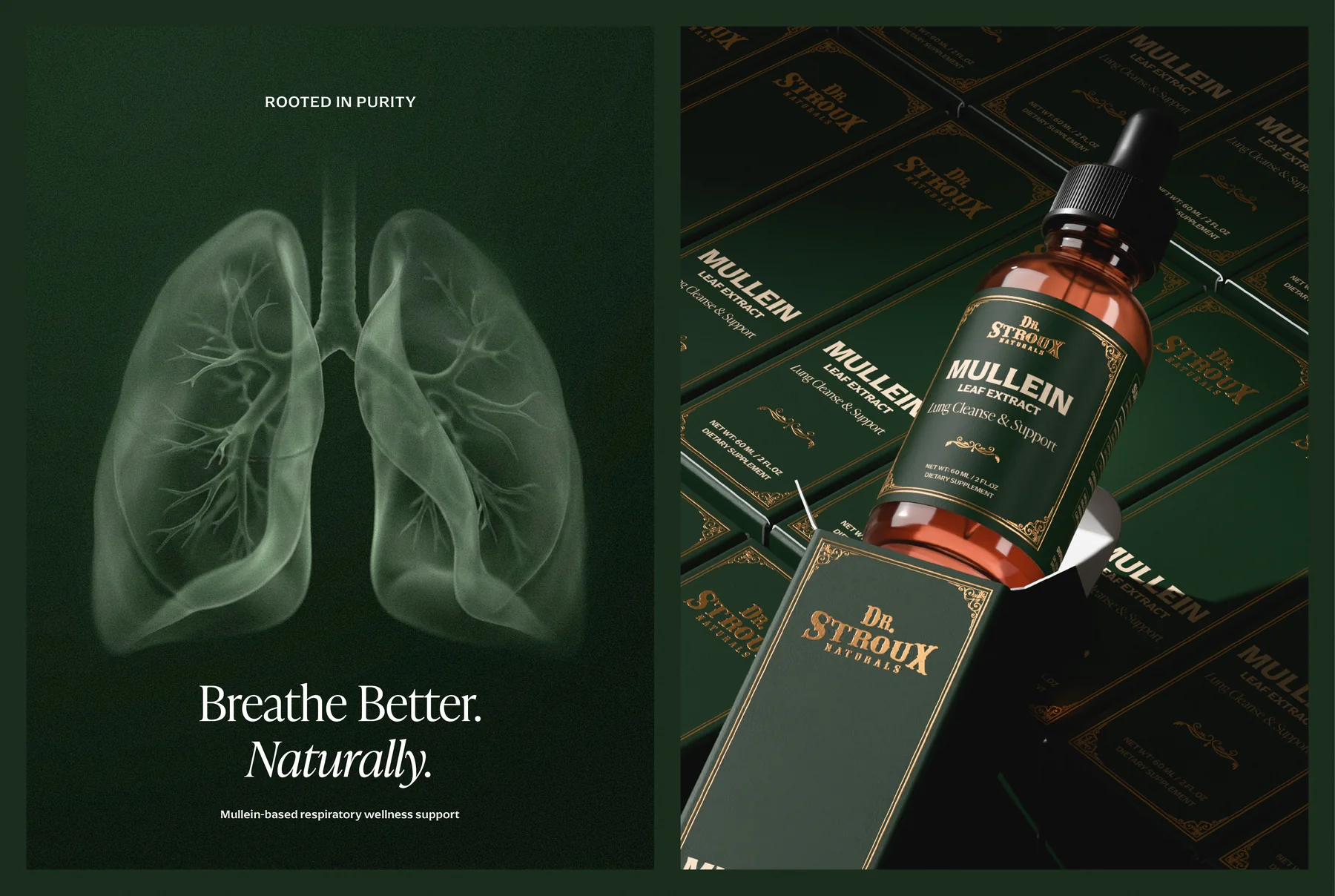
Dr Stroux Naturals makes a mullein leaf extract tincture. We designed its apothecary identity and packaging in deep green and gold.
Dr. Stroux Naturals
Herbal wellness
2026
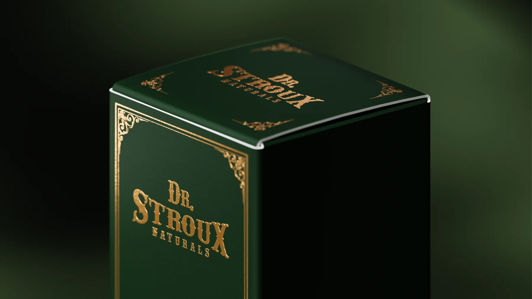
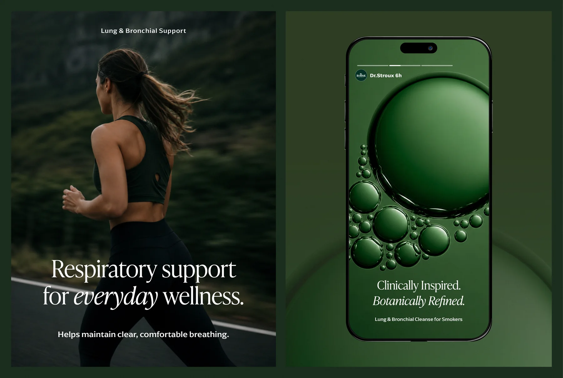
The tincture is made for lung and respiratory support. We designed the bottle label, the carton and the campaign layouts. All product claims shown were supplied and approved by the client.
The brand leans on an older idea of a natural remedy, an apothecary bottle rather than a clinical one, so the identity takes its cues from engraving and foil instead of the clean, clinical look most supplement brands default to.
Brief
Dr Stroux Naturals makes a mullein leaf extract tincture for lung and respiratory support. We were asked to build the brand and packaging, from the bottle label to the carton and the campaign layouts.
Challenge
The brand wanted to feel like an apothecary remedy, not a clinical supplement. That meant ornament had to earn its place, not feel like decoration. The label details also had to stay clear on a small amber dropper bottle and at full carton size.
Deep green, gold foil and two typefaces.
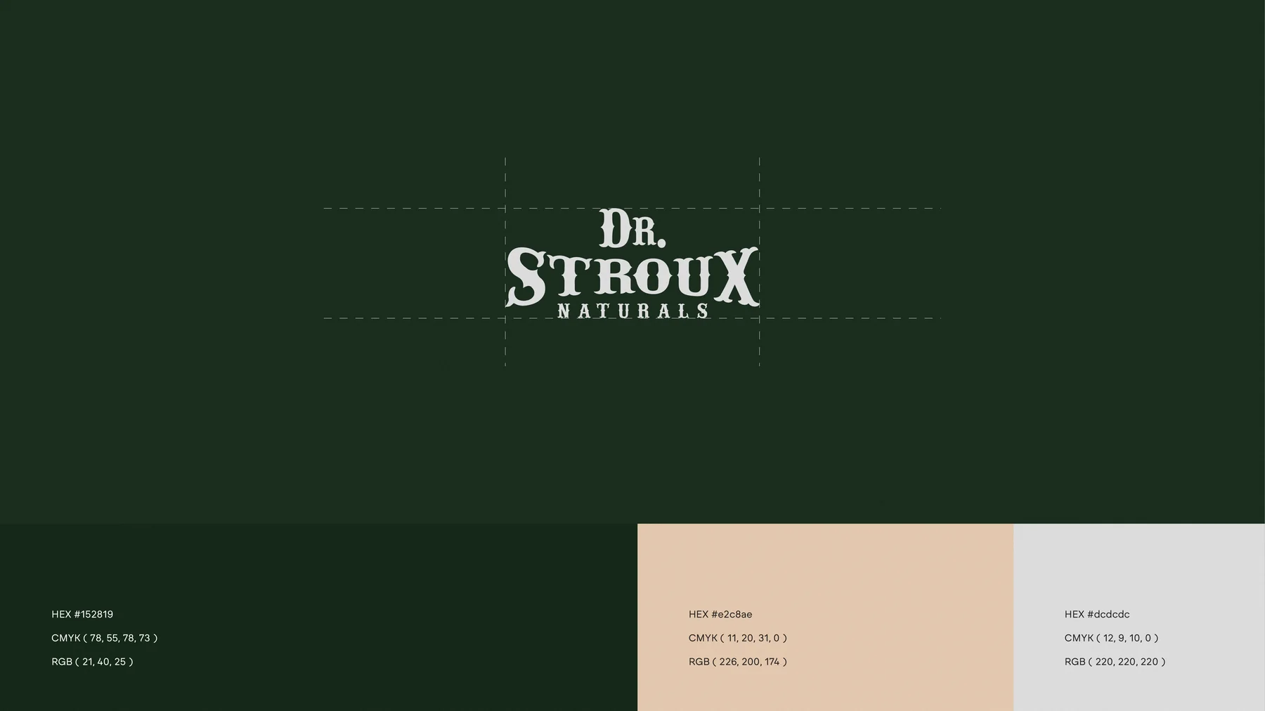
The Dr. Stroux wordmark is set in a distressed, hand carved style, foiled in gold on a deep forest green. A bold slab serif (Arpona) carries headlines and labels so they read clearly on a small bottle, while an italic serif (IvyPresto) is kept for a single line of campaign copy per layout, so the brand’s voice never feels crowded.
- Deep green#152819
- Warm tan#E2C8AE
- Light gray#DCDCDC
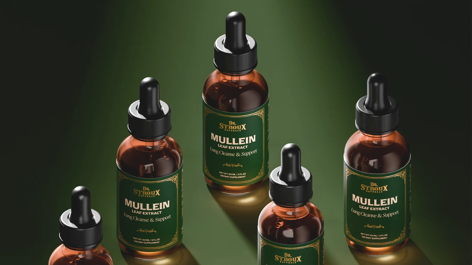
Ornament as care
The amber dropper bottle carries a label with a thin gold border and corner flourishes around Mullein Leaf Extract and Lung Cleanse & Support. The outer carton repeats the same frame at full size, foiled on matte green stock, so the ornament reads as a mark of care rather than decoration for its own sake.
Design Outcome
Deep green, gold foil and a framed label give the tincture a warm apothecary presence that holds from bottle to carton to campaign. The ornament reads as care, not excess, because it repeats in the same frame at every size.
- Gold foil wordmark
- Color and type system
Next project
Sahb
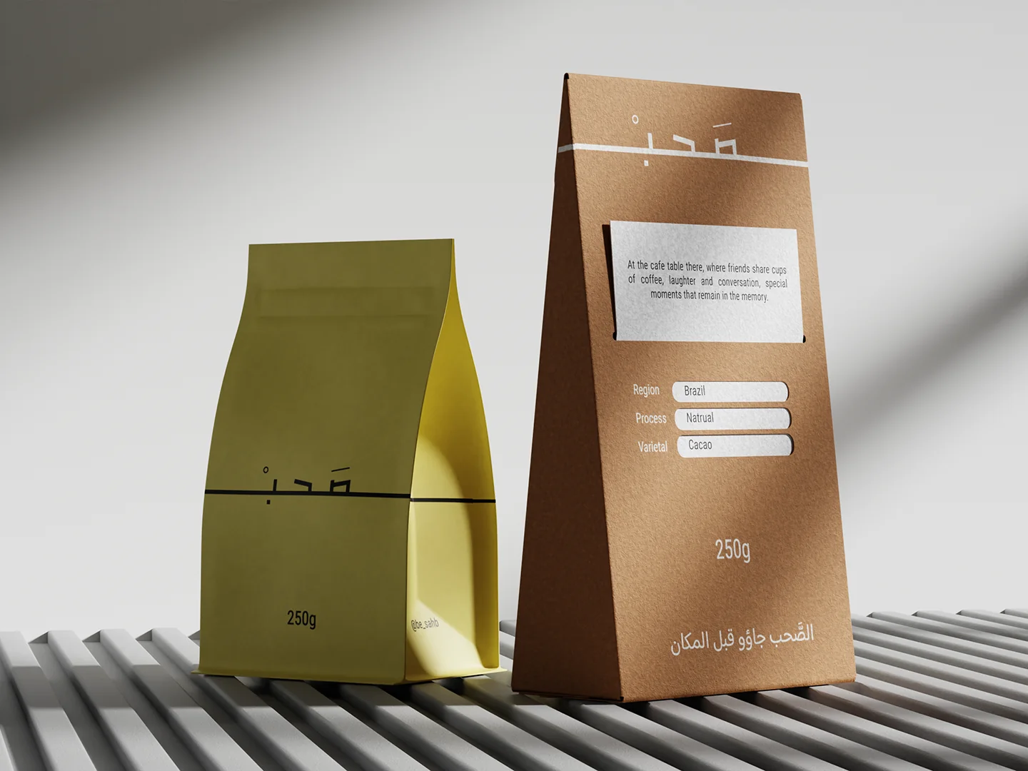
Brand identity and a packaging system for Sahb, a café brand: coffee bags, drip bags, flavored snack sachets, cups and a carton, in mustard yellow and toasted brown.
View case study