Stronga supplement packaging
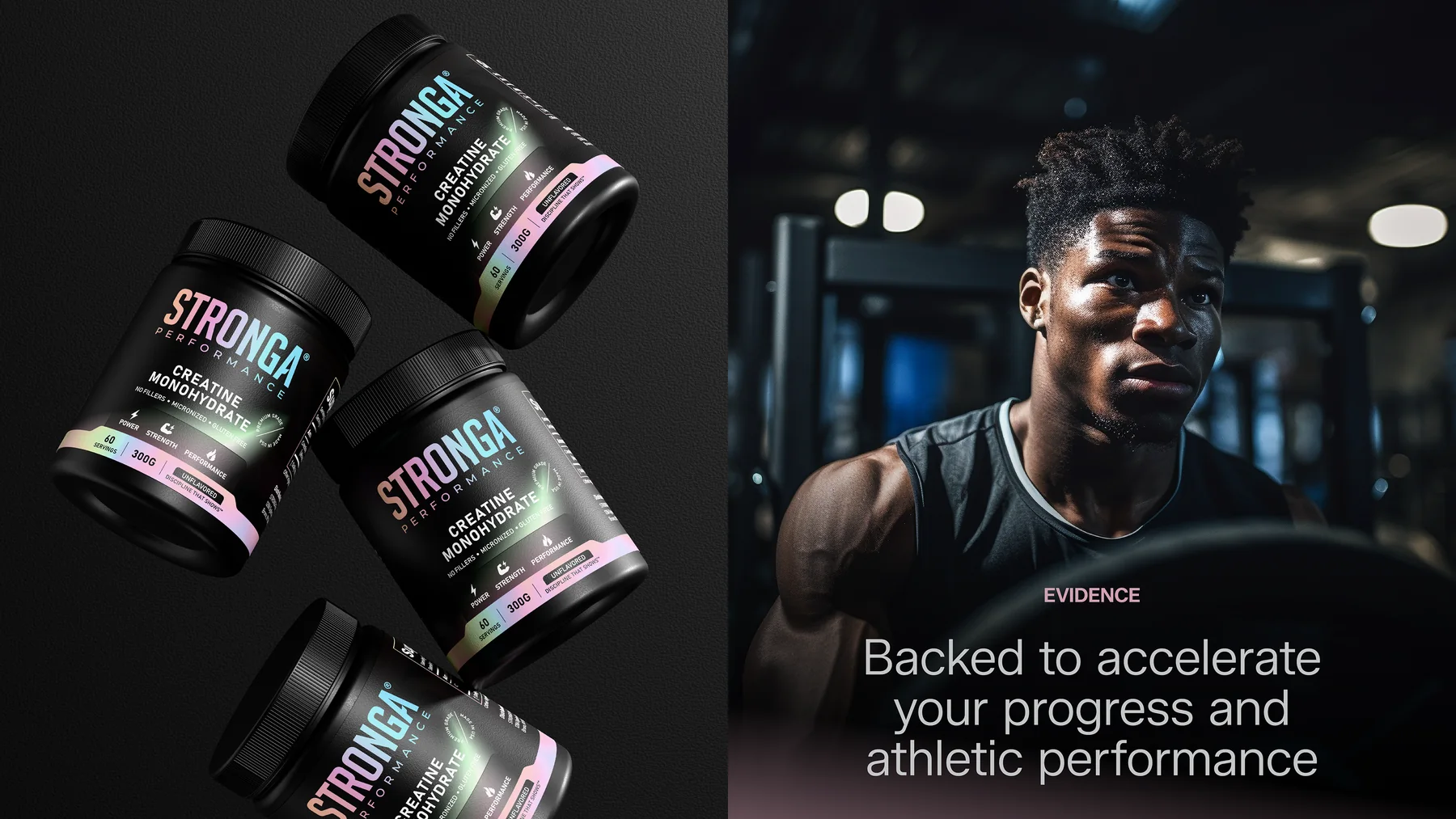
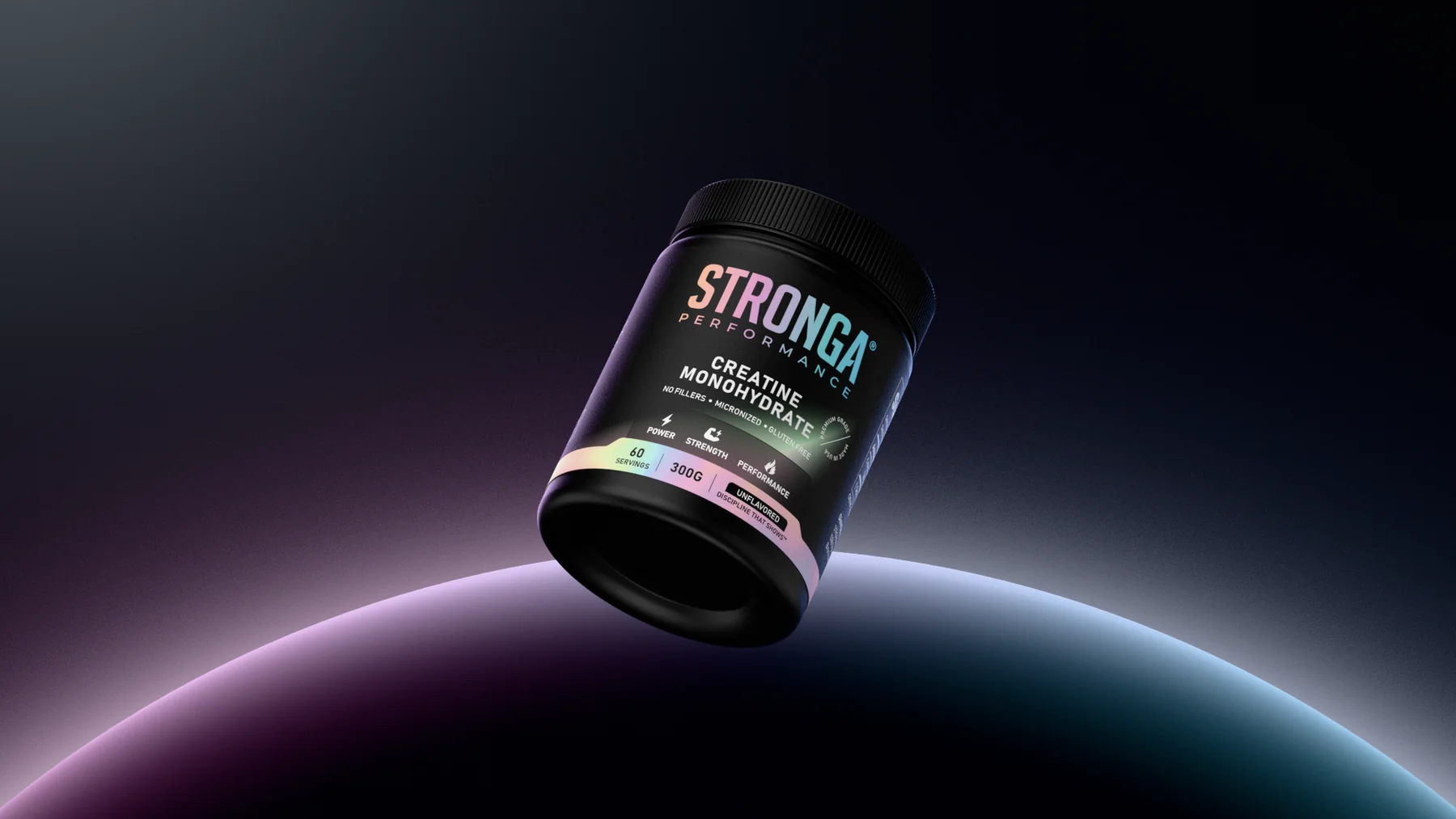
Stronga is a creatine supplement. We designed its tub label around a black base and one bright band built to read at distance in a gym aisle.
Stronga Performance
Sports nutrition
2025
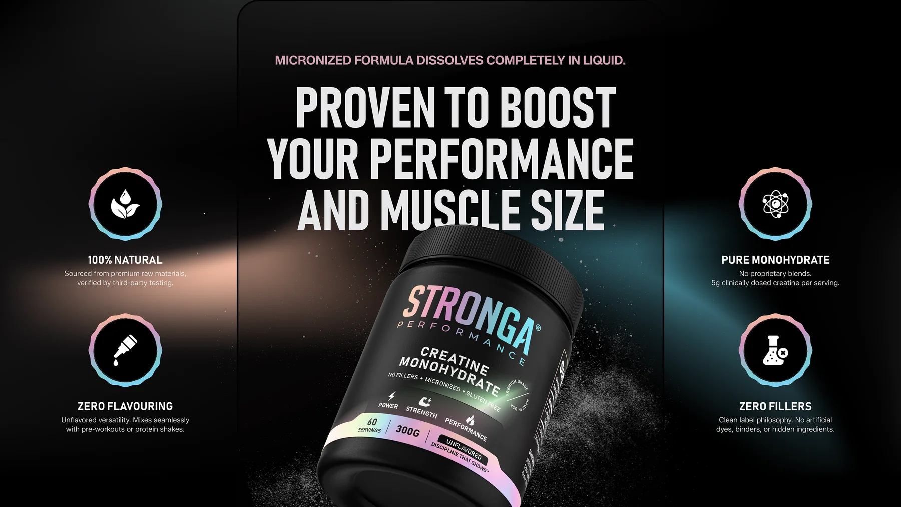
A tub on a supplement shelf has to work from across the aisle before a customer reads a single word. The label is built around that distance: a black base, one bright band of color, and a wordmark sized to be the first thing seen.
All product claims shown were supplied and approved by the client.
Brief
Stronga needed a tub label and a visual system for a creatine monohydrate supplement. We were asked to build the label, the color system, the type system and the renders to present it.
Challenge
A tub on a supplement shelf has to work from across the aisle before anyone reads a word. At the same time the dose facts and badges had to stay legible at small sizes, without fighting the brand name for attention.
One iridescent band on black.
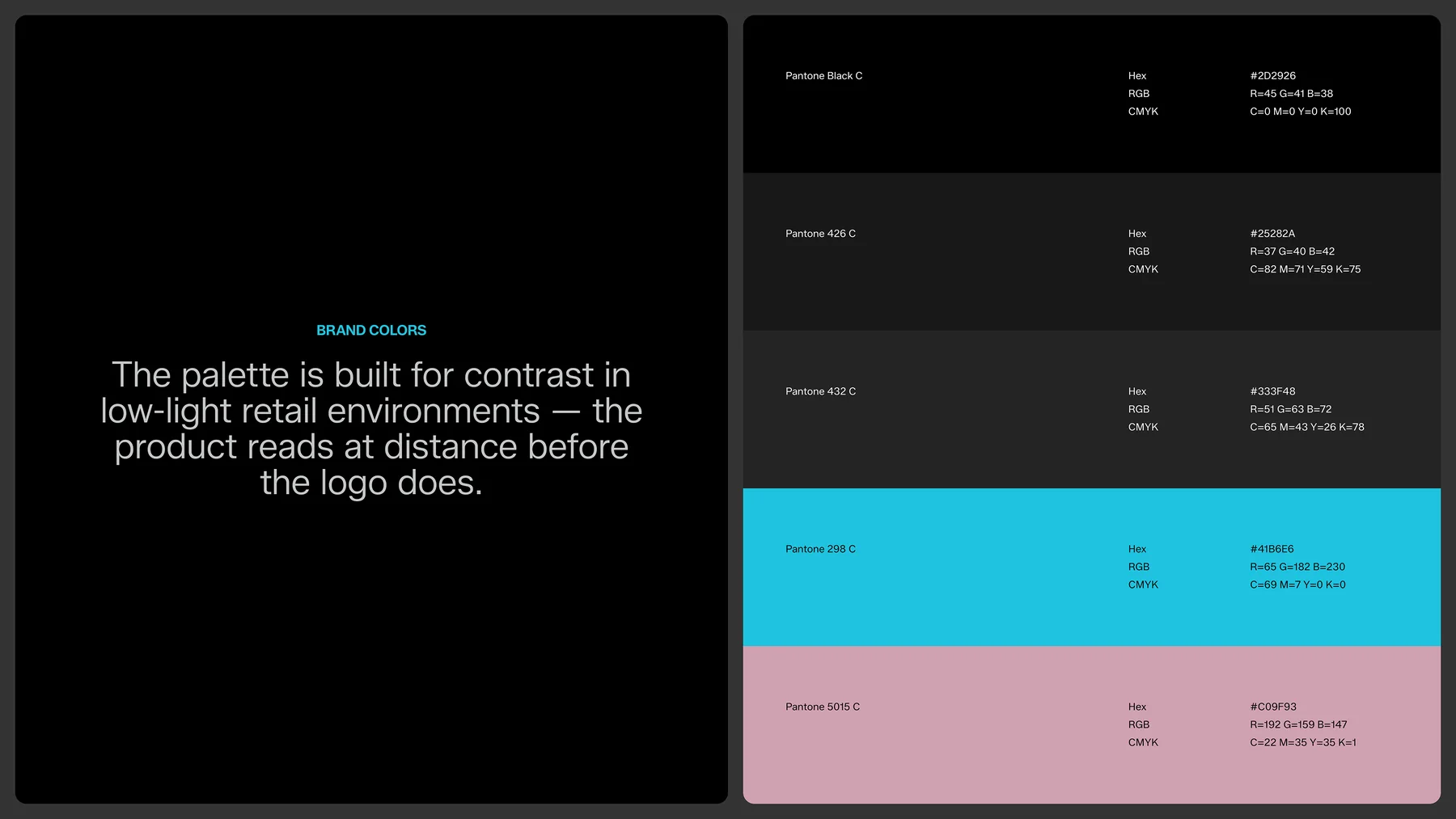
The label is black, with the STRONGA wordmark and a single label band carrying a two tone gradient from cyan to a dusty pink. The same gradient runs through the icon set and the product badges, so the color does the work of brand recognition on a crowded shelf.
- Cyan#1FC3DF
- Dusty pink#D0A1B2
A bold name and clear facts.
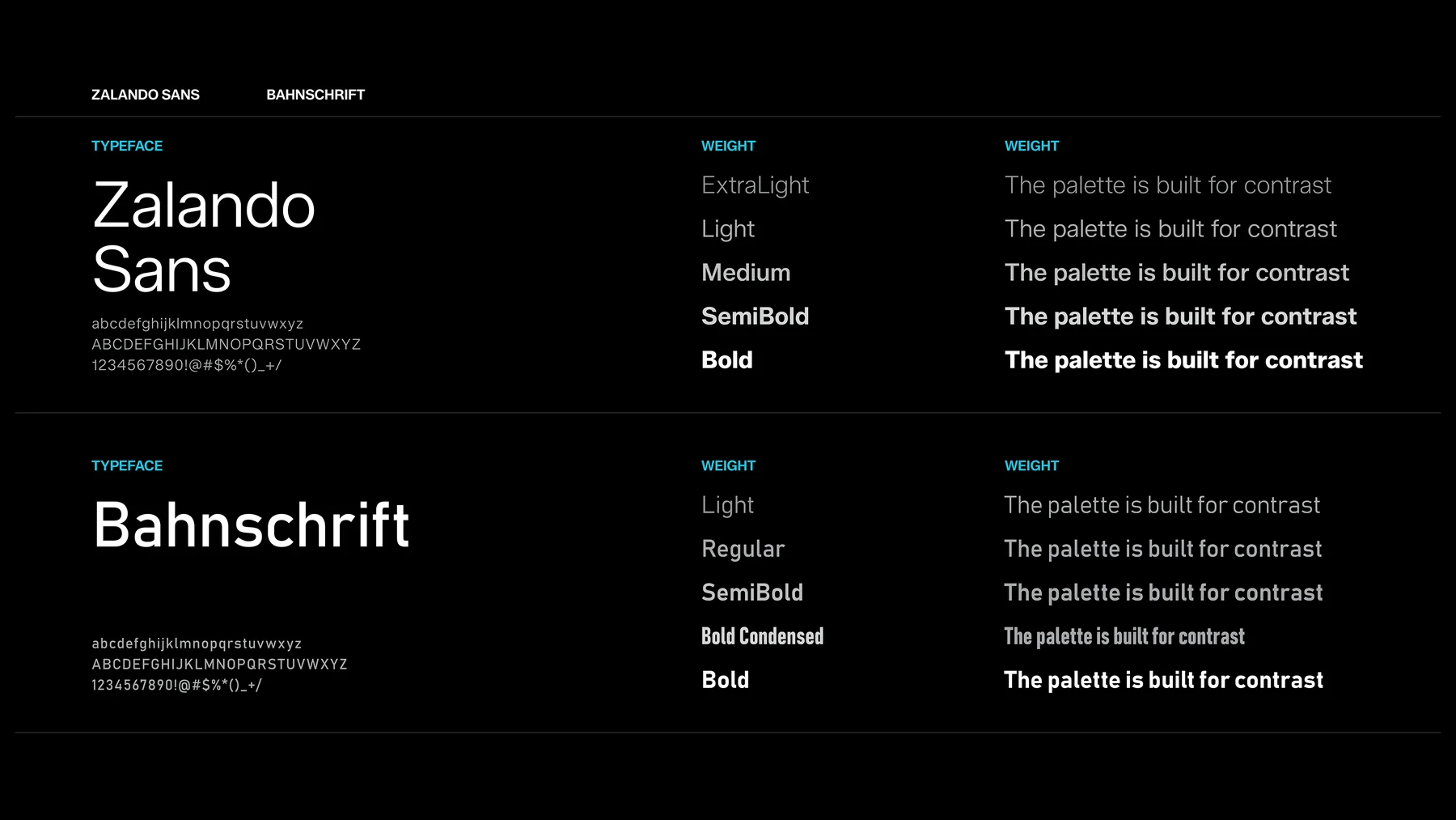
Two typefaces split the label’s job. A confident geometric face (Zalando Sans) carries the wordmark and headlines, so the brand is the first thing a shopper sees. A narrower face (Bahnschrift) handles the dose information and badges, so the facts stay legible at small sizes without competing with the brand name.
In the gym bag, not just on the shelf.
The same tub and color system carry into lifestyle renders built for the brand’s social and retail imagery, placing the product alongside the kind of training environment its customers already know.
Design Outcome
A black base with one bright band does both jobs. The pink to teal band is easy to spot at distance, and the same band running through icons and badges makes the tub easy to recognize on a crowded shelf and in gym imagery.
- Iridescent gradient for icons and badges
- Lifestyle renders for social and retail imagery
Next project
Kenatae
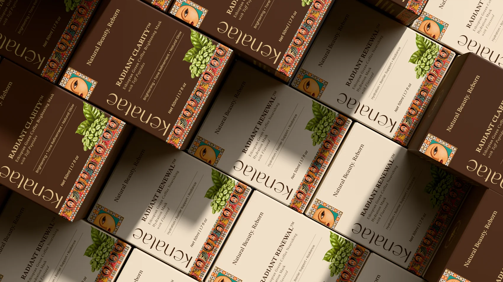
Brand identity and carton packaging for Kenatae, an Ethiopian inspired skincare line: a leaf mark, a woven pattern border and two brightening and hydration masks.
View case study