Kenatae skincare packaging
Kenatae is a skincare line inspired by Ethiopian ingredients and traditions. We designed its identity and cartons for two masks with a leaf mark and woven border.
Kenatae
Skincare
2026
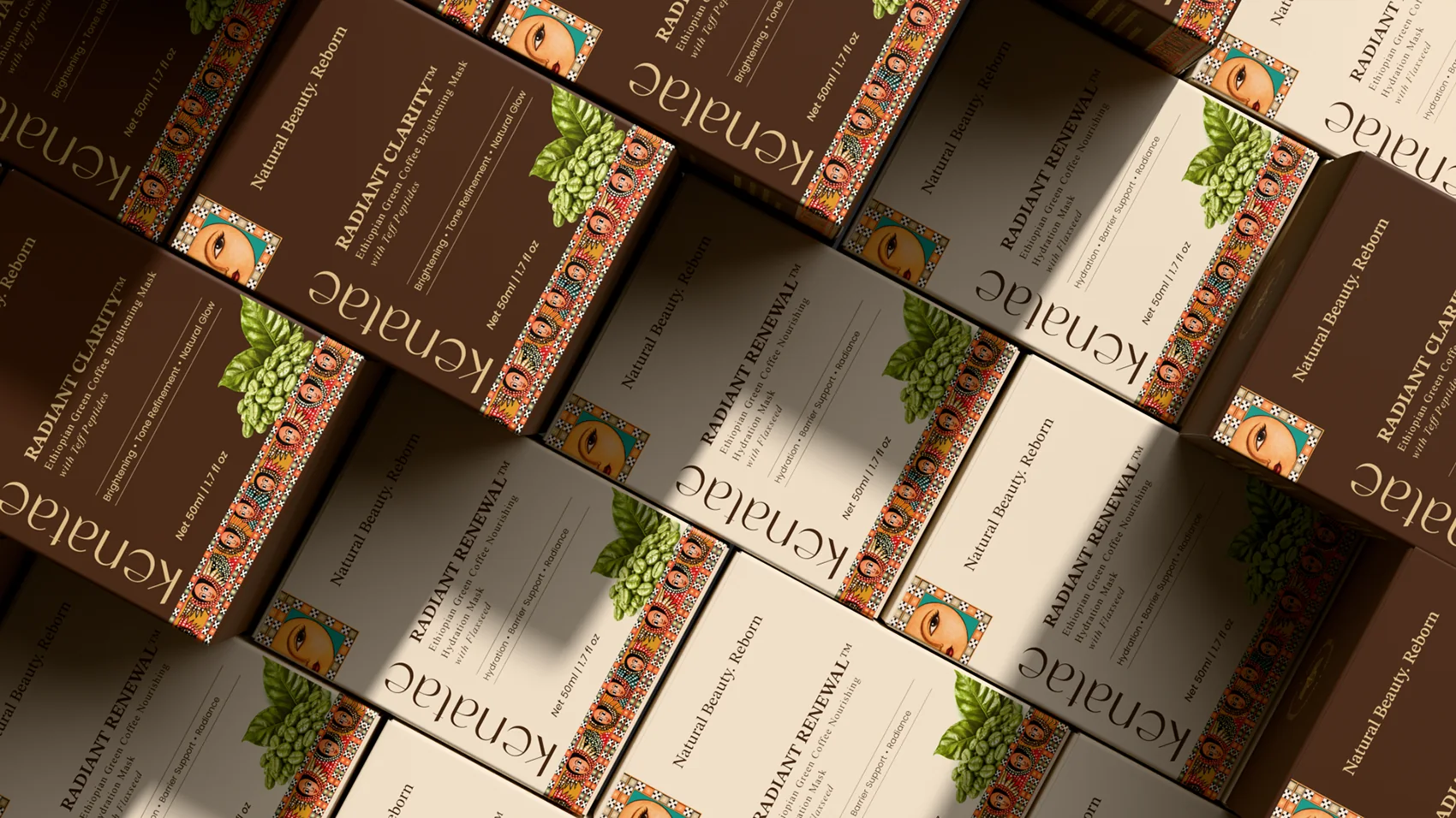
The two masks are Radiant Clarity, a brightening mask made with teff peptides, and Radiant Renewal, a hydration mask made with flaxseed. We also designed the campaign imagery that presents them.
The identity draws on Ethiopian textile patterns and portraiture rather than a generic clean beauty look, so the shelf presence and the ingredient story come from the same place.
Brief
Kenatae wanted an identity and carton packaging for two masks, both in the same 50 ml format. One is a brightening mask made with teff peptides, the other is a hydration mask made with flaxseed. We also made the campaign imagery to present them.
Challenge
The brand could not look like generic clean beauty. It had to grow from Ethiopian textile patterns and portraiture, while keeping the two masks easy to tell apart. Both packs also had to share the same label structure, from product name to benefits to ingredient story.
Mark and pattern
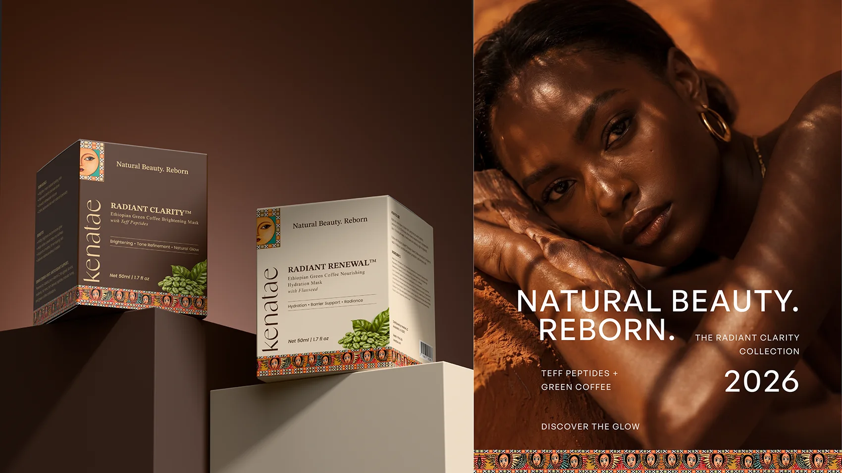
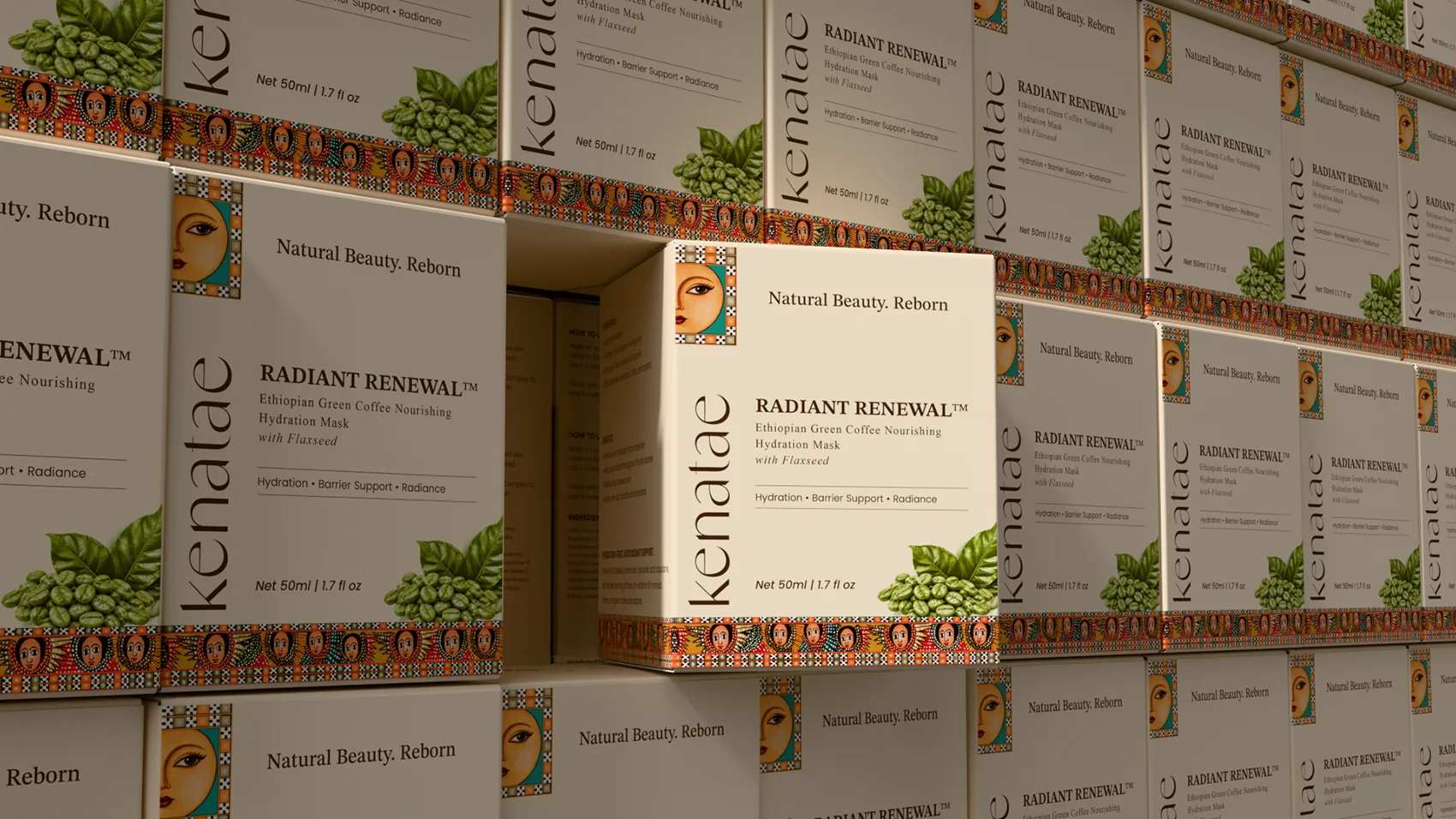
The kenatae wordmark sits under a small leaf symbol, with Natural Beauty. Reborn. as its line. A woven, multicolor pattern inspired by Ethiopian textile borders runs along the base of every carton, paired with a small illustrated portrait that repeats across the packaging and campaign work.
Two formulas
Two product colorways keep the SKUs apart on shelf: a deep brown carton for Radiant Clarity and a warm cream carton for Radiant Renewal, both carrying an illustration of the green coffee cherry the formulas are built around.
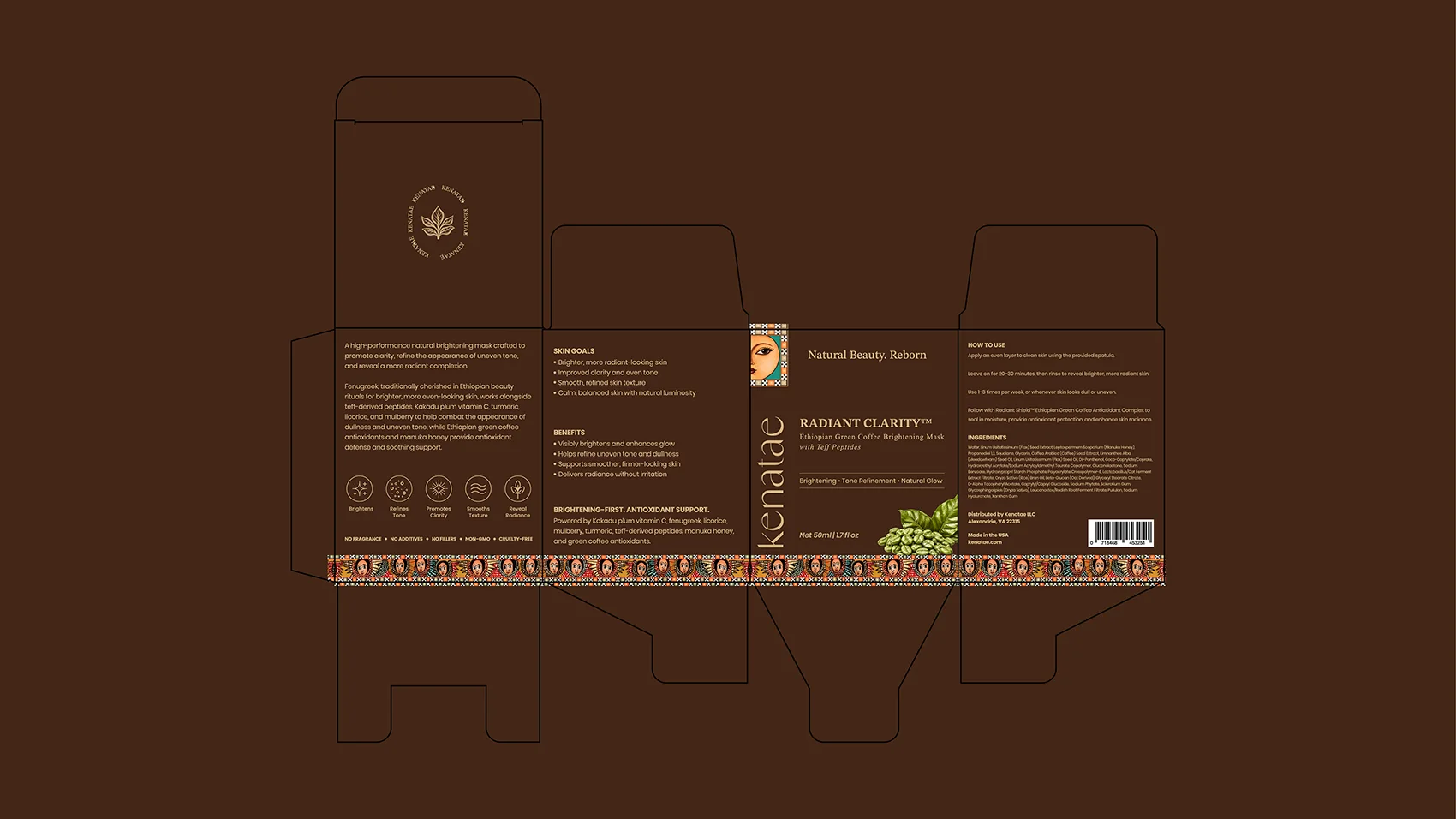
Both masks share the same 50 ml format and the same label structure: product name, skin goals, benefits and a short ingredient story, with the full ingredient list and usage steps on the back panel.
- Radiant ClarityEthiopian green coffee brightening mask with teff peptides
- Radiant RenewalEthiopian green coffee hydration mask with flaxseed

Design Outcome
A leaf mark, a woven border and two distinct carton colors give the line a clear source and a clear shelf system. A buyer can tell Clarity from Renewal at a glance, while seeing them as one brand.
- Leaf mark and wordmark
- Woven pattern border and portrait illustration
- Two carton colorways
Next project
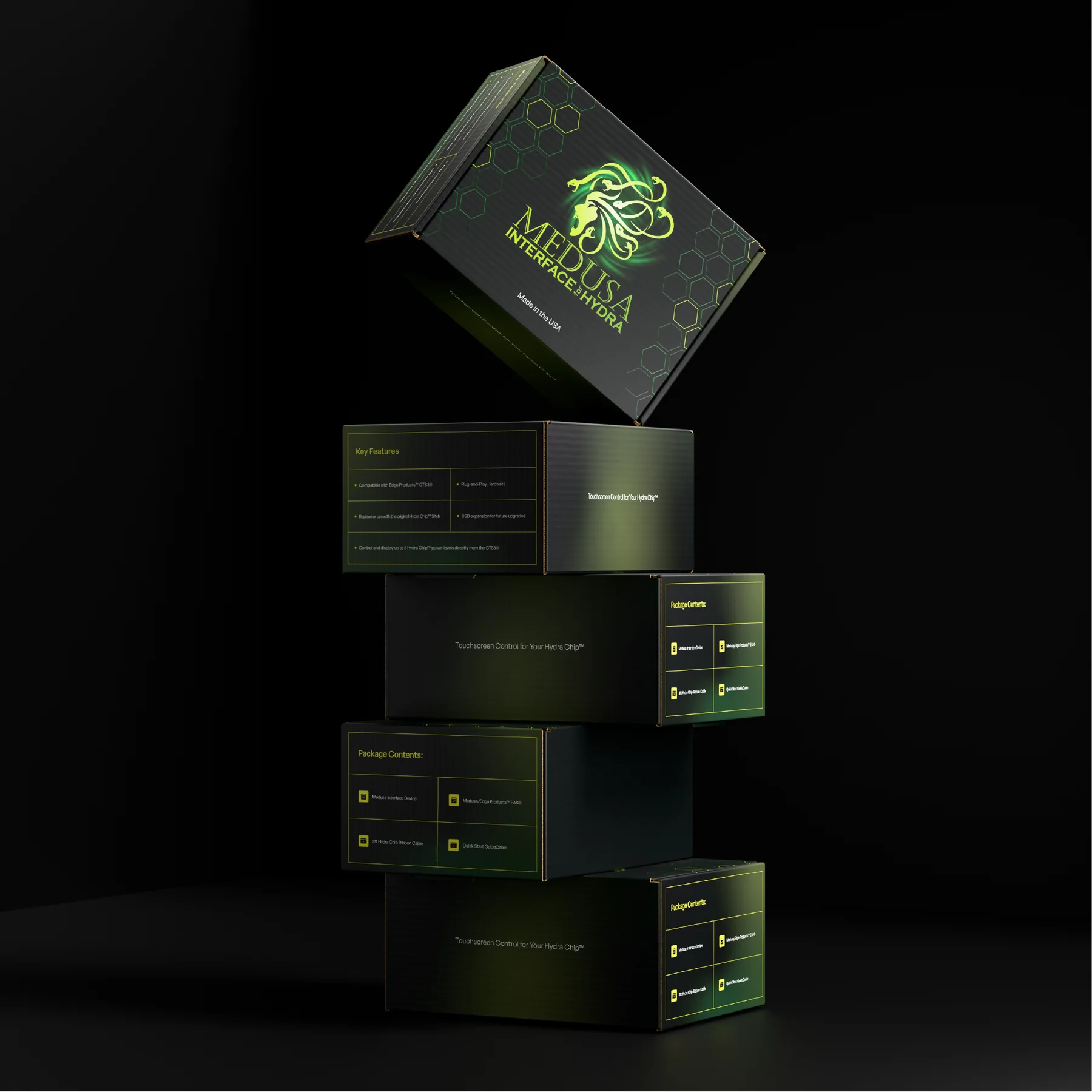
Medusa Interface for Hydra
Retail mailer box for the Medusa Interface, a Bluetooth accessory for Power Hungry Performance’s Hydra Chip: a black box cut through with an acid green Medusa mark.
View case study