DashMate AI retail packaging
DashMate AI is a smart car reader that plugs into a vehicle. We designed its retail box to explain a technical product outside and welcome the buyer inside.
DashMate AI
Automotive technology
2026
It works with a companion app and is made for everyday drivers as well as rideshare and delivery drivers. We also created 3D renders of both the box and the device.
Brief
DashMate AI is a smart car reader that plugs into a vehicle and works with a companion app. We were asked to design its retail packaging and to render both the box and the device in 3D.
Challenge
The box had two jobs that pull in opposite directions. Outside it had to explain a technical product quickly, with icons and app screens. Inside it had to feel like the start of a well made product, not a pile of parts.
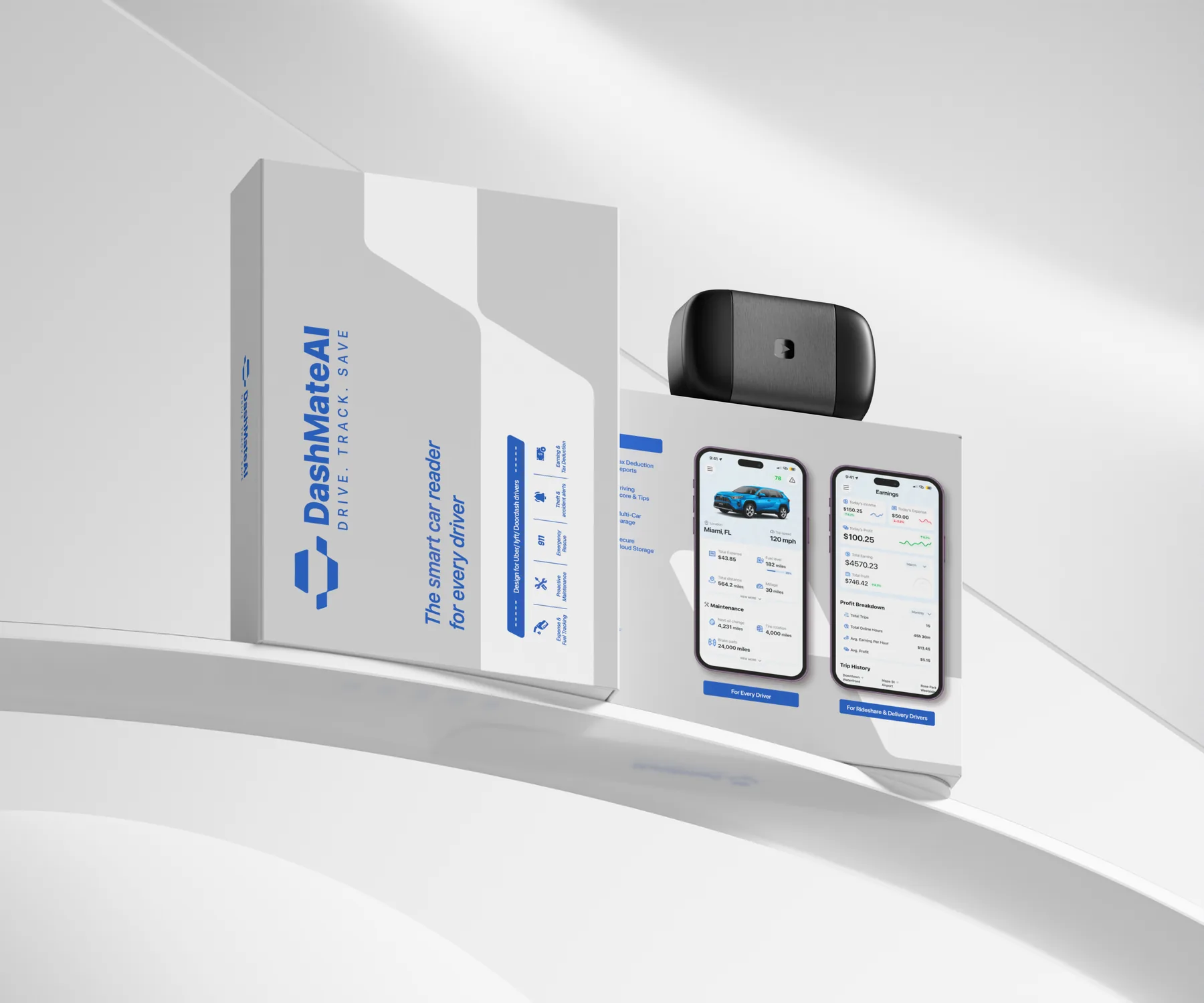
Clear before it is opened.
The light gray box carries the DashMate AI logo, the line Drive. Track. Save. and a short promise: the smart car reader for every driver. A row of icons covers the main features:
A blue band names the rideshare and delivery drivers the product is built for. On the back, two app screens show what the reader does, one for everyday driving and one for rideshare and delivery work.
- Expense tracking
- Fuel tracking
- Proactive maintenance
- Emergency rescue
- Theft alerts
- Accident alerts
- Earnings tracking
- Tax deductions
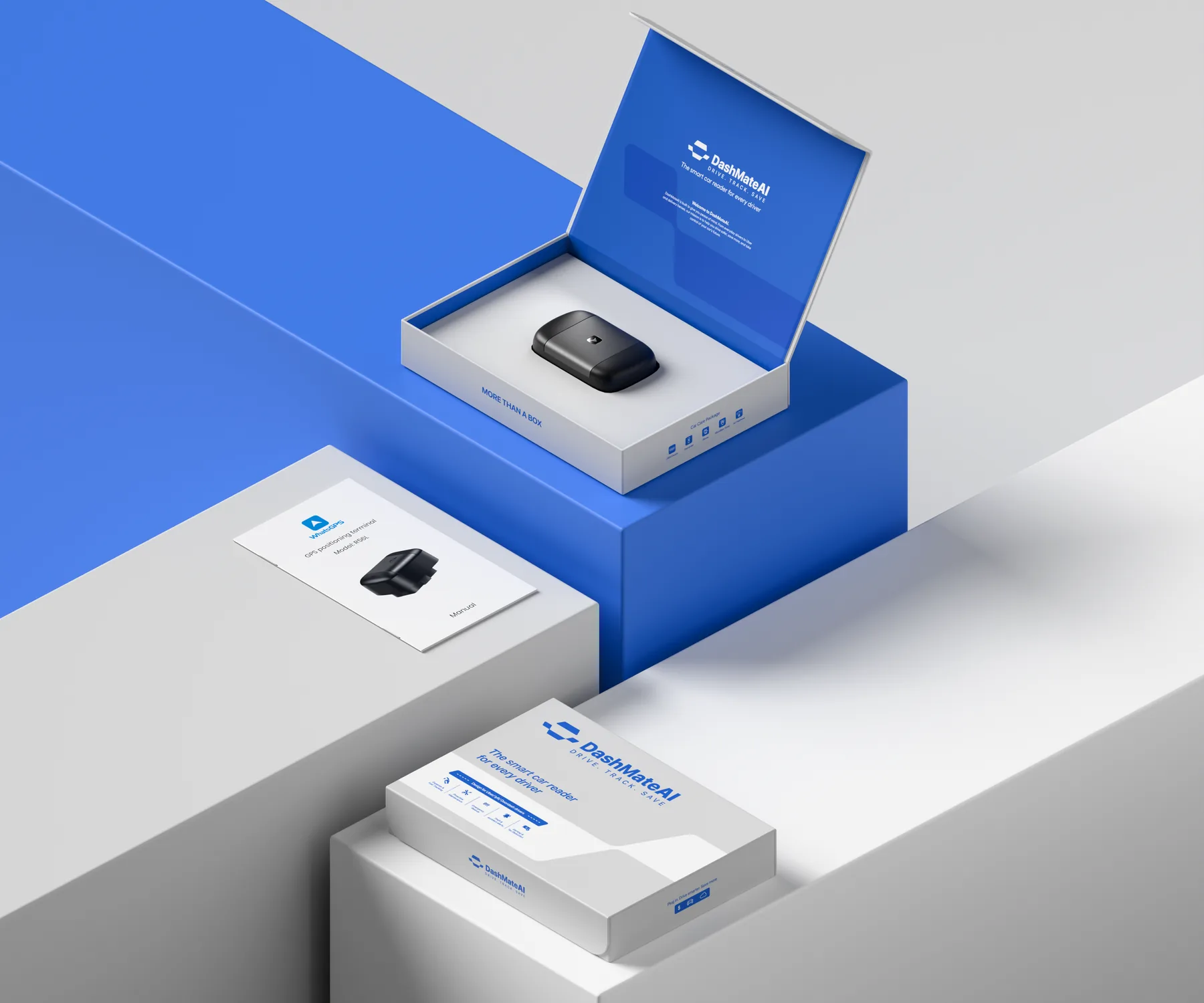
A layered opening.
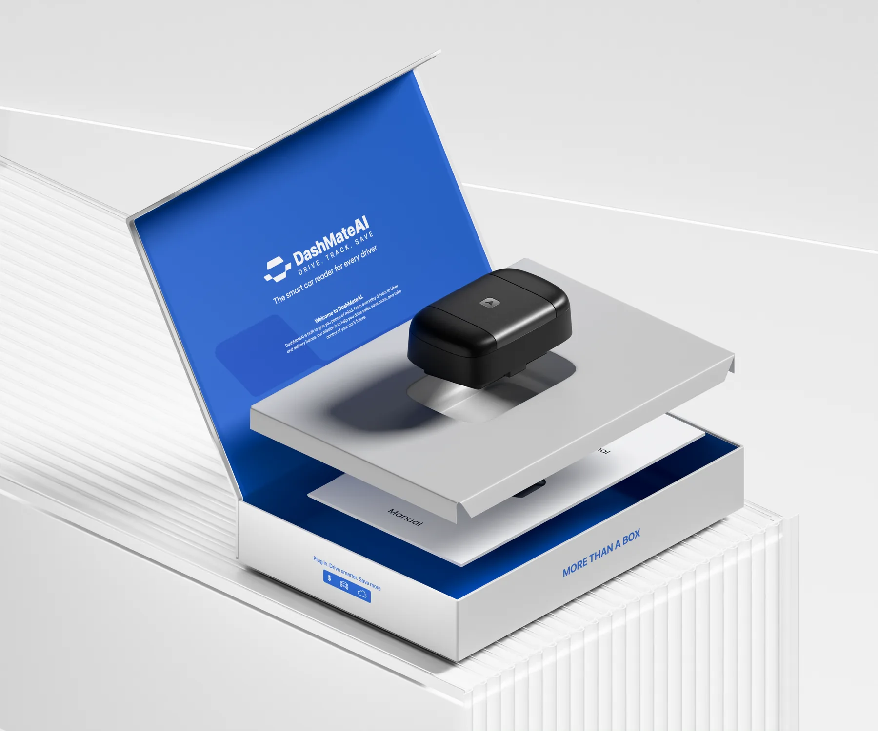
The flip top lid opens onto a full bleed brand blue, with the logo and a short welcome to DashMate AI printed on the inside. The reader sits in a recessed cavity in a gray tray, and lifting the tray reveals the manual underneath.
Small lines along the edges, such as More than a box and Plug in. Drive smarter. Save more., carry the brand voice beyond the first look.
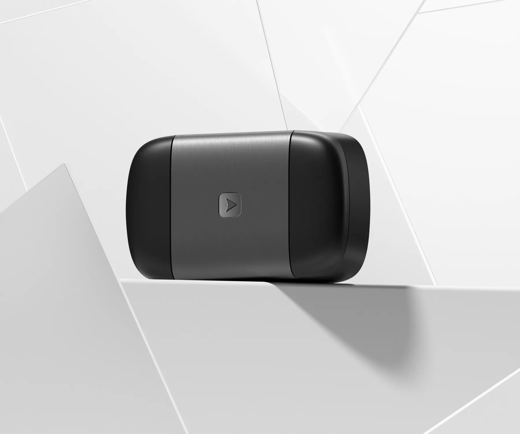
Product and pack, rendered.
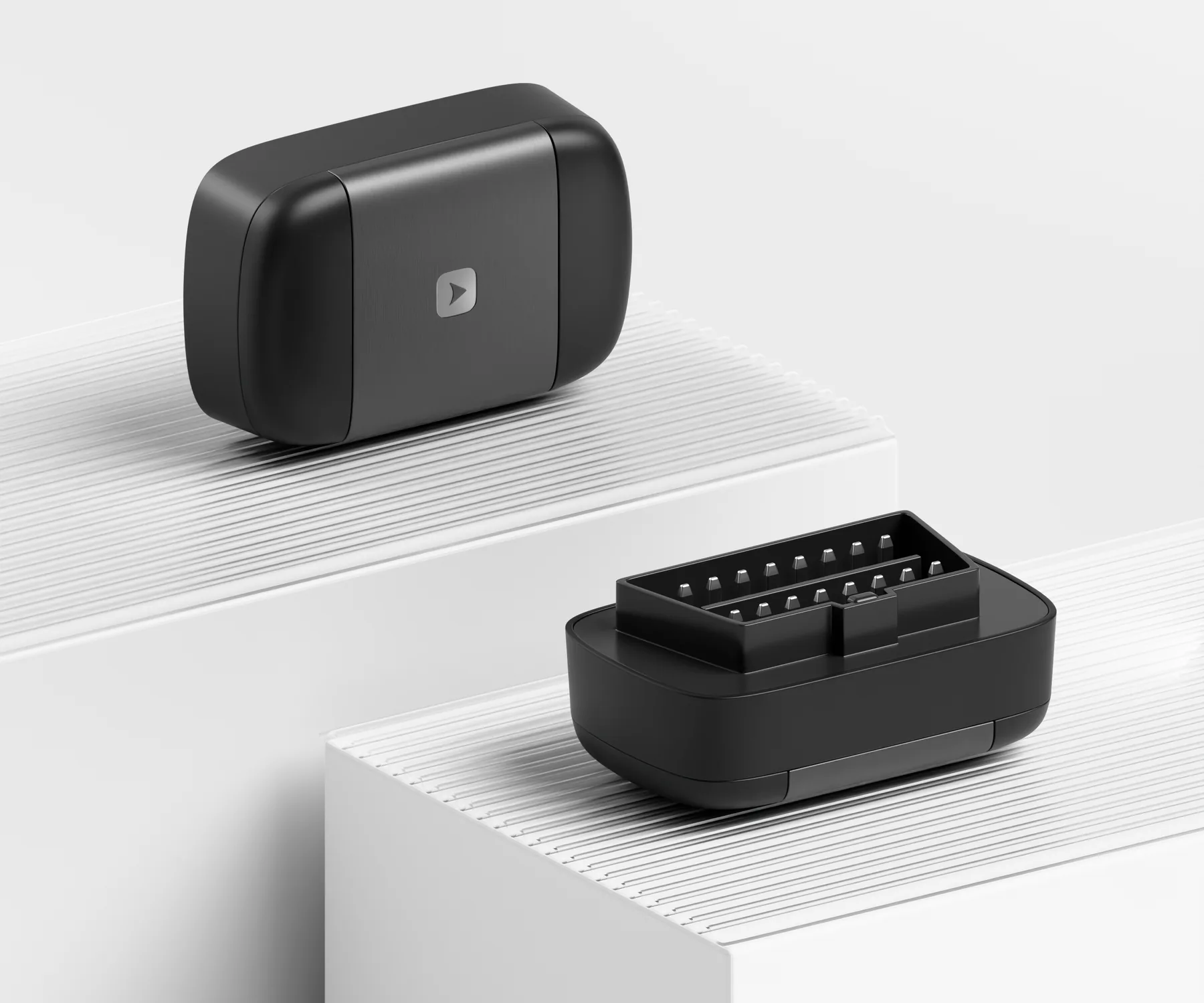
We modeled the reader in 3D, from the brushed metal band and small arrow mark on the front to the connector on the back, and rendered it with the box on clean, architectural white sets.
Design Outcome
Clear icons and two app screens on the outside explain the reader before it is opened. A brand blue welcome inside, with a fitted tray and a manual beneath, makes opening feel layered and considered.
- Inside lid and tray artwork
- Back panel with app features
Next project
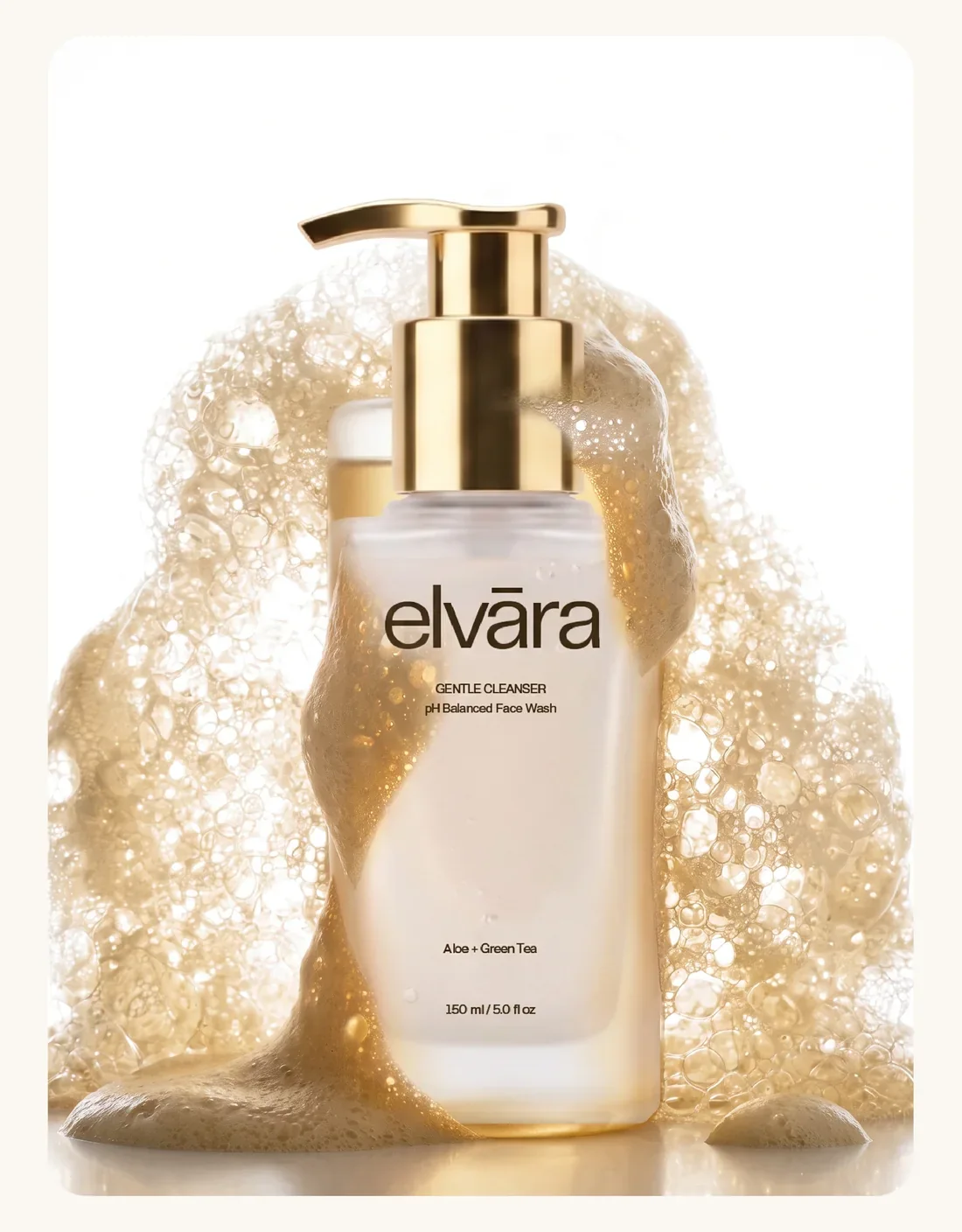
Elvara
Brand identity and packaging for Elvara, a three step skincare routine: a lowercase wordmark, a two color palette and quiet labels on frosted glass.
View case study